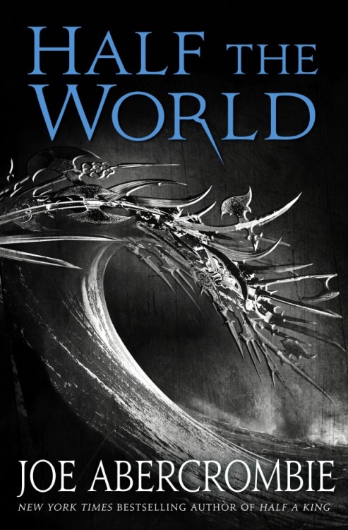
Surf’s up, boys and girls! Here’s the US cover art for Half the World by Joe Abercrombie, sequel to his soon-to-be-released YA(ish?) novel, Half a King. Just remember to apply a healthy layer of sunscreen chain mail before hitting the waves.
What a weird cover.

I have to say I’m a little uninspired by these covers. These are books my wife should be recommending to her male high school students, yes? I don’t think these covers are gonna grab them on their own. Which bums me out a little.
It is a weird cover, but given that I am not a fan AT ALL of this kind of cover, I do actually think this one is an interesting version…still bland, however.
I am interested in reading the books all the same.
At least the two covers tie into the books. HALF A KING takes place largely in winter, so the snowflake with swords motif works for what’s inside. I’m betting HALF THE WORLD takes place largely on the sea with ship battles galore. Either that, or Yarvi’s city is attacked from the sea somehow. And I wouldn’t be surprised if this cover is changed/touched up by the time the book releases.
Interesting that they’re going with b&w covers for the series. I’ll admit, I’m not terribly attracted to them. I’m still a bigger fan of character-oriented art than I am iconographic design. But it is different than what’s out there, and both covers have a hidden element in them, in that from afar they’d see one image, but as they get closer and/or pick up the book, they’ll see something else, which is a nice touch.
I kind of like it. It’s almost a perfect metaphor for vikings.
I quite like it, or at least the idea behind it, but if it was mine I’d be concerned that it’s going to be invisible on a bookshop shelf next to more striking covers. Of course given it’s Joe and Amazon rules us these days, no doubt that’ll not hurt sales at all!
I liked the sword-snowflake covers (US and UK) for Half a King, but this one just looks silly to me. What’s the last cover of the trilogy going to be? continuing the elemental theme with a swordnado?
@BDG — That’s an interesting allusion that I’d not recognized. Hmm…
The wave makes me think of Hokusai’s iconic “Great Wave off Kanagawa”, might be a coincidence. The gray (here: B&W) weapons seem reminiscent of the gray weaponry on the Iron Throne; but maybe that’s just me.
That said, BDG’s probably hit the nail on the head. Apparently, the Vikings sometimes were like an unstoppable armed wave sweeping toward their victims.
[…] Cover: Half the World by Joe Abercrombie, posted by A Dribble of Ink […]
[…] so ends the transformation of these miraculous weapons from a solid, to a liquid, and, finally, superheated gas. What comes next? No one […]