I’ve got one response for this:

(Okay, I actually have more than one response, natch, so bear with me. Orbit Books is one of the few big SFF publishers that understands the value in building a brand for its authors. When they weren’t happy with Brent Weeks’ cover for The Black Prism, they recovered the whole series and created an eye-catching and instantly recognizable series on bookstore shelves. They’ve done so with James S.A. Corey’s The Expanse, and Ann Leckie’s Imperial Radch series. The packaging and branding for Daniel Abraham’s The Dagger and the Coin was never their finest work, but it was bold and the emblematic weapon (sword, axe, torch, shield and spear) were consistent and matched scale.
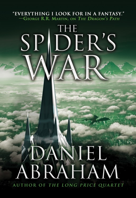
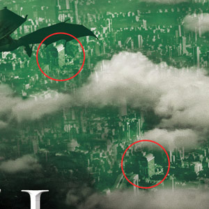
And, now, suddenly, here’s a generic fantasy landscape with a lifeless dragon and a repeating cloud pattern, with the same handful of buildings cut and paste beneath them.
Not only that, they’ve doubly burned the branding on the series by using the tower’s peak as the “i” in the title, something that’s unprecedented in the previous covers.
Come on, Orbit. You can (and have) done better.
This isn’t the fifth book in an ongoing series that needs a kick in the sales pants, it’s the final volume of an attractive series from an author with a lot of diehard fans. Rebranding a series can be a powerful tool for introducing a series to a new set of readers, or giving sales a kick in the pants. However, the cover of the fifth and final volume in a series certainly isn’t going to sell more copies of the preceding four volumes, and, if they’re trying to bump themselves up a few notches on the scale of epic awesomeness, presumably to match the climax of the trilogy, they’ve stumbled over the finish line in a race they led the whole way through.
Disappointed doesn’t even begin to describe my feelings.
Is it… final?
I got it from an official Orbit Books blog post showing off the covers for their upcoming releases, so…
Yeah, my sales manager senses say “temp. cover image for catalog.”
I’m with you. I just finished The Widow’s House last week so the world is very fresh in my mind. As soon as I saw this I was so disappointed. Not only doesn’t it fit with the established style, but the art itself isn’t anything great. You want to put emphasis on the dragon then bring the dragon. Honestly, I would have rather seen one of the green glowing culling blades on the cover. I know they had a sword on the first book, but they could have done it well. Or I don’t know how about a spider image of some sort…
I hope Michael is right, and they go with something better. It’s a pretty cover, but its not up to the standards of the other books or in that style at all
This is the source post: http://www.orbitbooks.net/2014/09/15/spring-summer-2015-seasonal-us-cover-launch/
Nothing there indicates that the covers are catalog temps, or not final. In fact, they invite readers to “comment away with reckless abandon.” That said, I hope Mike’s right, too.
I love these books so much. The covers not so much. They haven’t been as cool or inspiring as the Expanse or Imperial Radch. Ah, well. Hope the book continues to bring the awesome.
The cover of the Falcon Throne listed in that post is different than the one on Amazon. I suspect this is indeed the quick-fix for the catalog (the catalog has to have SOMETHING, often a year before the release, so they end up being rough).
Every other time they’ve included Abraham in one of these “First Looks” posts, it’s been the final cover art. This (preview) vs. this (final).
I’m familiar with catalogue covers (Lauren and I have had long chats about catalogue covers…), but I don’t think that’s what we’re seeing here. As far as I can tell, Orbit has never posted a non-final version of a cover from Daniel Abraham on their blog. I’ll happily mark the cover above as in-progress/catalogue copy if that’s the case, but I’m not sure there’s any evidence to support the idea (besides our misgivings.)
I’d love to be wrong.
Well, *now* it’s the catalogue cover.
Kinda wondering why you’re so bothered by this… seems such a minor issue… hey, it’s your blog, you can “cover” what you want… still, if this is the biggest genre-related thing bothering you right now, you’re doing pretty good, I’d say…
I have too much time on my hands, Dave. ;)
It has a cheap, lifeless digital art quality too it. It’s also horrendously ugly and uninspired.
Actually, I recall there were some differences between the initial Dragon’s Path cover and the final, changing what the sword looked like.
I feel like the covers went off the rails with The Tyrant’s Law. The flame-y dragon thing looks like nothing to me and doesn’t fir with the cool weapons of the other covers. This one is about on par with that, I would say.
And anyway, TLPQ had GORGEOUS covers and apparently didn’t sell worth a damn, so many this is what the market wants. I don’t think it breaks the brand so much that it looks like part of a different series, which is the important thing.
The cover is not good.
I bet what underneath it is. And that’s what truly matters to me. ;)
I could care less, I’ve always hated fantasy and sci-fi covers which is one of the reasons I’m so happy to own an e-reader. Let them do whatever they want with the cover, so long as they let Abraham do what he wants with the story.
[…] Cover: The Spider’s War by Daniel Abraham, posted by A Dribble of Ink […]
Just finished the Widow’s House last night – when is publication of book 5 – Spider’s War – thank you.
I never understand the fuss about covers of books…Does anyone judge books by their cover? Especially the 5th book in a 5-book series?
I think The Widow’s House is the best book of the series so far….