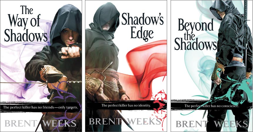
In a shocking turn of events, the cover of Brent Weeks‘s next novel, The Black Prism features a menacing looking dude, a white background and a splash of bold colour (obviously signifying magic, or something). This is a major departure from The Night Angel Trilogy, his first series.

Okay, seriously. I suppose they want to give Weeks his own identity, so you know a Weeks novel on the shelf, but this is a little blatant. The original covers were interesting when they first hit the market (and effective, too, given Weeks sales and popularity), but couldn’t Orbit have done something to give this new series its own identity? Removing the hood from the Hollister model on the front doesn’t count.
On the other hand, it’s quite cool.
well, that’s a standard-seeming template for Orbit US covers, so I’m not surprised at all. They must know something about how cover art appeal that I don’t. But then I find my tastes and opinions for cover art are far from typical.
I was hoping that Orbit was starting to expand their design concepts based on the covers for Jesse Bullington’s The Sad Tale of The Brothers Grossbart and Phillip Palmer’s Red Claw, which were both unique and eye catching.
They obviously do know what sells (as I mentioned in my post), but I can’t see how having six novels, by one author, in two separate trilogies that look almost exactly the same is going to be more appealing/less confusing for the casual book buyer. As far as I know, The Black Prism doesn’t have anything to do with Weeks’ earlier books, so why does it look like the fourth book in The Night Angel Trilogy?
“So why does it look like the fourth book in The Night Angel Trilogy?”
Because the first three books sold shitloads of copies largely on the back of the covers and the release schedule, so Orbit are obviously happy to make this look like the fourth instalment even if it’s completely unrelated.
It’s not a bad cover, just rather tired. A bit like the premise of the novel – can’t believe Weeks is reeling out the whole good brother/bad brother gig. Dull.
‘It’s not a bad cover, just rather tired.’
This is exactly how I feel. The cover looks nice, just seems cheap of Orbit to fall back on an old design, as opposed to giving the series a new identity. Hell, it doesn’t even mention that it’s part of a series on the cover. A frustratingly heavy-handed approach from Orbit.
Hey, all, hope my dropping by doesn’t stifle conversation or even criticism. Like the text, a cover has to survive on its own merits. That said, this wasn’t an intentional release. “Hell, it doesn’t even mention that it’s part of a series.” Um, that’s because we haven’t settled on a name for the series yet. It’s not the final cover. (Though honestly, it’s probably close.) Judged with that caveat, fire away.
The blurb over at Mad Hatter (quoted from Amazon) is full of mistakes and spoilers. (Again, due to the unintentional release. No one’s fault.) And I’m not even finished writing, so maybe the heavy fire about the story itself can wait until August?
Thanks for dropping by, Brent.
I came across that Amazon blurb a couple of weeks ago, but chose not to reprint it here, given your wishes that it not be spread around due to inaccuracy and spoilers.
Do you mind if I ask how leaks like this happen? Or how, for instance, Amazon gets a hold of an old blurb for the novel? I assume it has to do with book-selling, and convincing Amazon and other booksellers that your novel is worth stocking, but is that the only answer?
As James said, standing on its own, the cover’s striking. In a genre as diverse and imaginative as Fantasy, though, I wish publishers would take more risks, like Orbit did with Bullington’s and Palmer’s novels. But, the argument will always rear its head that publishing is a business, before anything else. It’s just frustrating for me to see the designers and marketers as a major publisher dip their pen into the same pot they’ve been to many times before.
UK publisher’s site has a different blurb, but not yet cover art:
http://www.littlebrown.co.uk/Title/9781841499031
Hi Aiden —
I think you’re wrong here — both about how to effectively launch a new series from an established author and about this cover (which I think rocks) — but going into the details of this design is something I’ll leave for our creative director’s upcoming post at orbitbooks.net.
To answer your question though: we prepare a lot of material to sell a book in advance of publication – even before the book arrives. So copy is written and changed and revised for quite a while leading up to the point a book is on sale. Occasionally that copy ends up online and needs to be adapted after the fact. The copy you see online early tends to be from the catalogs that we use to sell to bookstores, as is the case here.
Aidan, as I understand it, publishers like Orbit gather everyone together for huge sales meetings twice a year. Editors tell sales people and publicity people what’s coming in the next year, and everyone tries to form sales plans for each different book. (My book is slated for August.) I think with The Black Prism, the meeting happened to fall quite early. Obviously, in-house, they expect these things to be rough draft so far in advance. At the next meeting, everyone knows things will be finalized. I think Amazon asked someone for info on my book, and that someone thought they were being helpful by providing them what they had–which happened to be a totally outdated blurb and a not-final cover. Honest mistake.
I also understand your thoughts about the cover. It’s a delicate balance to strike. You want people who liked my first books but maybe don’t remember my name to see these and be reminded. Or booksellers who sold the book but never read it to be reminded of the Night Angel books. At the same time, you don’t want it to look like Night Angel #4. (It’s not.) This is something Orbit and I talk about.
Regardless of how you feel about my newest cover, I think one has to admit that Orbit takes way more chances than any other fantasy publisher with its covers. You mentioned Grossbart and Palmer, but also look at Monster by A. Lee Martinez, or Mr. Shivers by Robert Jackson Bennett, or Tempest Rising, or A Madness of Angels, or Jeff Somers’s trade paperbacks… you may not love them all, but they’re all striking.
Anyway, this is getting long. More info over at my website. (Not shilling, just don’t want to hijack your thread here.)
And Jussi, thanks. That’s way more accurate, although one of the character’s names is wrong. I should probably go tell my publisher about that…
Alex and Brent,
Thanks again for dropping by and pulling back the curtain a bit. I think, in the end, we’ll probably need to agree to disagree, given the opposite ends of the spectrum which we approach the issue. As a reader, I don’t really care about the marketing behind a book, I want it to have a unique, interesting cover that really speaks about what I’ll find between the pages.
Brent’s cover, while interesting, is generic and could be found on a large number of ‘gritty’ Fantasy novels hitting store shelves. Stuff like Daniel Abraham’s Long Price Quartet (from Tor, not the Orbit covers), Brandon Sanderson’s Warbreaker, Jemisin’s The Hundred Thousand Kingdoms and Bacigalupi’s The Wind Up Girl all have striking covers that speak eloquently of the story contained within. Lou Ander’s over at Pyr does a fantastic job of choosing art and creating unique covers that sell the book within.
Brent said, ‘At the same time, you don’t want it to look like Night Angel #4. (It’s not.) This is something Orbit and I talk about.’ So, ummm, this doesn’t look like Night Angel #4? Because the guy doesn’t have a hood? It’s even got the smoke and the decayed looking, flowery design that’s shared between the earlier trilogy. It’s little things like that that take the cover from an homage to Brent’s earlier work and just a lame re-hash.
I’m certainly aware of Orbit’s willingness to take chances, as evidenced by all the Orbit cover art I’ve showcased here over the year. That’s why it’s surprising to see a re-hashed cover coming on one of their biggest releases for next Summer.
Alex, you’re right. I don’t know as much about publishing and marketing novels as you. But I know what I like, and I know what I’m likely to pick up on a store shelf. It’s frustrating when a cover screams ‘Marketing Team’ and only whispers ‘Design Team’. I understand that it’s a business, and Orbit has to make decision that will lead to the sale of as many books as possible, which I certainly don’t begrudge, but as an enthusiast commentator on the genre, it’s clear that this novel is not being marketed to me, but rather to the casual Fantasy fan, who’ll buy the novel because they think they’re getting another Durzo Blint story.
In the end, however, it’s what comes after that cover that really matters.
I understand what Alex is saying. A great deal of conversation goes into Random House books published, I know that. Like Orbit, there are two or three meetings each year at Del Rey. It is publisher and editor in chief and editors and production team and publicists and marketers and art department, etc. The editor gets their pitch and based on their having read the book, they must convince the others of what the book is about, what the title should be and how it should be best marketed.
This is not a terrible thing most of the time. The ultimate goal of such meetings is to try to put the pieces together to sell the most copies of the book. If a title change is needed and it will sell more books, it is done. Choice of cover art and design is also similarly looked at. Both authors and publishers want this to happen.
Sales equal continued success of all involved.
Every once in a while, however, a marketing decision or art direction decision can backfire and actually damage the writer and the book/series. A publisher can survive due to volume of other writers but can a writer? Sometimes they do. Sometimes they don’t.
I don’t mean to scare you here, Brent. As I said, it is rare thing.
I’m worried that what Aidan is expressing has a foundation that is all too real. Things can backfire. The points he has made make sense to me as a cover lover — from the pose of the figure to the swirl of smoke, to the empty white space, etc. The only thing missing is the hooded cloak. The rest mimics Brent’s previous three books.
There is a danger in that; readers aren’t dumb and they don’t like to be tricked.
In the end, it can be controlled through effective online marketing, pre-publishing interviews and blog posts, etc. Brent is now an old hack at this now. I think Aidan bringing this up should not be necessarily fought or argued with but instead incorporated into how you all approach this new book’s release and how best to — you guessed it — make the most sales.
Just an opinion. ;)
(Sorry for the late chime-in folks, was trapped on jury duty yesterday. You know they TAKE YOUR PHONE? Barbarians.) I am the Creative Director on this book, in case you haven’t met me or read me or heard reference to me before. Nice to meet you. Just let me say we’re still fiddling with the cover…sometimes things sneak off our servers before I have a chance to officially launch them on our blog & I’m trying to get better at managing that…but it’s close enough to final to talk about.
I am so glad that you all are speaking highly of Orbit’s attempts to push the design envelope (we’re trying! it’s not easy!) but the simple fact is, there are times to try a DARING NEW LOOK and there are times not to. Of course we were going to go with a similar look and the same photo-illustrator as the last series (the fabulous Calvin Chu) because Brent had such success with the Night Angel Trilogy that we have to think about a wider range of readers than our fabulous, wonderful, hard-core sci fi and fantasy fans (that’s you guys). I hate the “B” word, but we really needed to Brand the author. A lot of people picked up Way of Shadows solely because it cracked the bestseller list, and we have to make it easy for that huge amount of new readers to find him again, when they’re not used to looking for a fantasy author.
That said, we did start from a much different place design-wise. Yes, same illustrator. And yes, fancy ornament. However, I think the pose is much more dynamic. It’s absolutely an action shot rather than the more static poses of the Night Angel books. And we all said “but no white background” first thing. Originally we had a really dark black background – but from a purely aesthetic point of view, it didn’t work. It was too dark, too quiet, not eye-catching enough. And, due to the really interesting magic and visual systems (can’t wait to read it, right? Nyah-nyah) in the story we didn’t want to go with a color background. Gray was bland, multi-colored backgrounds looked a little, well, feminine. Silver foil was way too….studio 54. So, although we agonized over it, we ended up back on white. Is it a safe choice? Absolutely. Will Brent Weeks fans see it from a bajillion miles across the B&N floor? Absolutely. Maybe if you all ask nicely I’ll put up some of the MANY work-in-progress covers and you can judge for yourself.
See you on orbitbooks.net! I just posted Tom Holt’s US debut if youre interested in more critique…
@Lauren – I for one would love the change to see some of the alternatives like you did with Best Served Cold.
All of that definitely makes sense, Lauren, and thanks for the insider look at your thought processes.
As my grandfather told me at an early age, one must be able to take the praise as well as the criticism. I hope Orbit and all other publishers out there understand what my grandfather means.
Some people are going to love the cover. Others will question it. This is the nature of all creative endeavors. In the end as long as the yield is positive, it does not matter. And that’s the thing Orbit and Brent have to keep in mind.
I will put up some in-process stuff for the cover when we launch it on orbitbooks.net…
@shawn: i would have run screaming from publishing AND graphic design long ago if i didn’t embrace criticism. Honestly, the posts that just say “awesome” are nice but not as interesting as a critical dialogue. The only thing that ruffles my feathers is when people assume – and they often do – that the approved cover was exactly what the designer envisioned in their head. Being a designer is often being a referee, as many people & departments all have a say in the final product. I am very lucky with Orbit that a lot of what I design comes through the process without too much change, but i think that has more to do with me understanding the subject matter at the outset as a fan as well as just as a cover designer.
Say all you want about the cover, those Night Angel Trilogy covers are what made me buy the series. The jacket copy wasn’t that good. I’m glad I bought them. Plus I like the splash of rainbow on this latest one. I like the effective use of white space. I dare say A Dribble of Ink uses white space effectively.
Fun discussion — thanks!
[…] a link to a gallery of reused (over and over again) covers for Historical novels; and Aidan from A Dribble of Ink posted the cover art for the new Brent Weeks novel which is very similar to the author’s previous covers in a different […]
Wow, this has been a mindblowing exchange…and it was fascinating to see the contribution from Brent Weeks, as well as from Alex and Lauren at Orbit.
The one thing I’d add about the process of designing covers is that the writer DOES get a say…So when Tim Holman showed me the – utterly outrageous and silly and nothing to do with the story! – cover of Red Claw he was at pains to say he wouldn’t use said cover if I wasn’t happy with it.
Obviously I WAS happy with it – thrilled indeed! – but there was some intense discussion between Tim and myself about the cover which lasted, as I recall, about 3 hours. And as a result of that dialogue, some minor but significant changes were made by Lauren to the original design – the flying saucers on the edge of the page, for instance, which I just adore. (And which we then used as a section dividing motif in the book.)
Ultimately writers have to trust to the designer’s talent and vision. But writers DO know much more about their own work than what goes on the page – the tone, the feel, the mood, and myriad other indefinable “things”. And though the cover of Red Claw bears no relation to the story (nope! there are no beetles! and no plasic spacemen!) the humour and the pulp feel of the cover are, in my own view, exactly right for what I wrote.
Which is lovely, and also kind of spooky.
[…] debate on the nature of covers, centred around SFF, but I’m sure they apply across the board. It started off with the cover of The Black Prism by Brent Weeks and has now moved on to the cover I was showing off a couple of […]
[…] Moher, prolific fantasy blogger that runs A Dribble of Ink posted last week about the irritations of repetitive fantasy covers, citing the art for Brent Weeks’ new […]
Holy cow!! This has been one interesting thread to read!!
[…] Mad Hatter, who has some uncanny ability to dig out Cover Art before it’s supposed to be revealed, posted the artwork for the US […]
In all, I really think that the saying: “Don’t judge a book by its cover” stands here. If I was a new reader and saw the cover, I’d be interested in reading it(it worked for me with Night Angels). If you are a reader of Brent Weeks however, you shouldn’t care so much about the cover. It should be the content. Sure, the cover looks good… and may say Night Angels, but ultimately if you are already a fan of Weeks you wouldn’t care about cover art, you’d care about the STORY. Since the story isn’t out and what is out is all spoilers or incorect, you cannot say the story will be good. To be honest, I don’t buy books for their covers… I buy for their story. The covers are just a way for people to get that intial attraction and then want to look at the blurb. By looking at this cover… can you honestly say you wouldn’t look at that blurb even if it looks like a fourth installment? I know I’ll be looking at it.
[…] also published comments on the blog A Dribble of Ink, which also published the cover, warning fans to beware of spoilers available […]
Fantastic thread and its great to see proffesionals leaving their mark. Cant wait for Black Prism, Weeks will not dissapoint!
[…] few months ago, I raised a bit of a stink when I stumbled across a leaked cover for Brent Weeks’s The Black Prism. My main criticism […]
[…] Abercrombie’s name. (I’m trying to figure out how this is much different from the controversial leaked cover for The Black Prism by Brent Weeks. Sure, the First Law Trilogy and Heroes happen in the same world, but they’re […]
As i understand it there is a new cover poested on Mr.Weeks personal website…somthing to check out if you havent already.
[…] worked in the past and riding it until it keels over from exhaustion. A good example of this is the early cover for Brent Weeks’ The Black Prism. Orbit found huge success with Weeks’ first trilogy, […]
[…] but you don’t want to leave existing fans of the author cold. So through the early cover for The Black Prism and into the original hardcover design, I was really trying to feel my way through […]