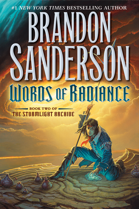
So, let’s talk about the recently revealed cover for The Way of Kin— err… wait, I mean Words of Radiance, the second volume in Brandon Sanderson’s Stormlight Archive. I won’t ever blame you for mistaking the two books, so, please, afford me the same luxury.
Now, let’s talk a little bit about one of publishing’s biggest catch-22 arguments. Fans have cried ‘foul’ time-and-again when publishers step in and change the style of a series’ covers midway through. It’s great when a completed series gets a re-issue, but, I think I can speak for most fans when I say that it’s nice to have a matching set of books on your bookshelf. On the flip side, though, there are a lot of cases of lazy design work, with the publisher, or at least the art department, jumping on board with what worked in the past and riding it until it keels over from exhaustion. A good example of this is the early cover for Brent Weeks’ The Black Prism. Orbit found huge success with Weeks’ first trilogy, in large part because of the striking covers. Back then, the hooded dude was still waiting tables, just trying to catch a break. Now, he’s everywhere, we’re sick of him, but he established a strong brand for Weeks and his Night Angel Trilogy. The first cover leaked to the public looked like a sequel to Weeks’ first trilogy even though it was an entirely new series. The cover was changed before publication. And then a new cover was issued for the recent trade paperback edition of the novel. It’s gorgeous. Orbit has done a great job of recognizing the need to create a strong brand for Weeks, but not at the expense of driving the concept into the ground.
This cover for Words of Radiance takes the idea of brand and flogs it like a dead horse.
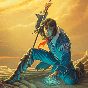
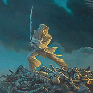
Like all of Whelan’s work, it’s a visually striking piece on initial glance. The colours are gorgeous, and the background is menacing and magical. But, then you see those weird onion things again. And the awkwardly posed character (is he picking up that glowing rock? Why’s he looking at me and not that bad guy?) And the monochromatic ninja literally standing on a pile of bodies. Then, finally, you realize that it’s the exact same cover Whelan produced for The Way of Kings and A Memory of Light.
Whelan discusses his thoughts on the process of creating the cover on Tor.com:
I was aided in this part by Irene Gallo and the editorial staff at Tor Books. After conferring with Brandon Sanderson they agreed on a short list of key scenes for me to consider. Irene sent me these possible scenes in an email accompanied by copious notes about characters, dress, and other necessary details.
I chewed over these potential scenes, read what I could of the actual text, and let everything simmer in my head while I completed other tasks. But even with the limited scope of the scenes that were selected for me, possibilities abounded in such profusion that I began to feel paralyzed with indecision. All directions looked equally tantalizing.
With such a bewildering array of opportunities before me I fell back on a formula that I’ve employed regularly through my career: set out to establish the value relationships of the image first and save the issue of color for the last step before beginning work on the actual painting. Once I get started, ideas start popping up in my head even while I’m doing something else; in such cases I’ll do a sketch on whatever is handy. Many of these quick loose sketches or “thumbnails” are done on sheets of old manuscript paper [from books I was commissioned to do in the pre-digital days].
Whelan explains the process that he and Irene Gallo went through to find the right ‘scene’ to present on the cover, but, in the end, it feels more like they knew which character they wanted to portray, and replicated the layout, composition and emotional resonance of the first cover and stick a couple of different characters in there. I’m not so sure that it’s a scene, as it is a character portrait. Whelan explains that some of the composition was directed by his having access to “a provisional type layout which was extremely helpful in [showing him] where to alter the composition to make things fit in the open areas.”
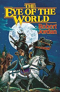
Love ’em or hate ’em, the original covers for the Wheel of Time novels were a tremendous success at creating an easily recognizable brand for Jordan’s novels. Though artist Darrell K. Sweet’s work deteriorated in quality through the end of the series, with The Gathering Storm being a particular low point, each edition of the series felt iconic and unique, while still identifiably a Wheel of Time novel. Compare the compositions of The Path of Daggers to The Dragon Reborn. Both clearly novels in the same series, thanks to the branding of the consistency of the titles and other decorations, but with unique compositions, tones and weight. Even comparing The Path of Daggers to The Eye of the World, which both feature people riding horses, you can see a difference.
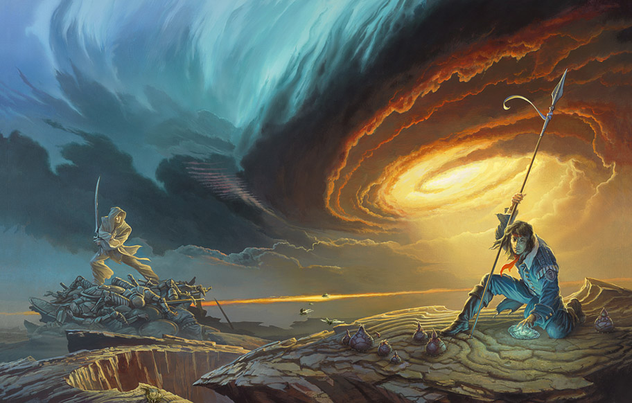
A quick comparison of the two covers for The Way of Kings and Words of Radiance illustrates just how similar the covers are:
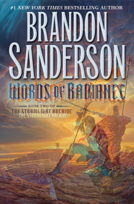
I’ve loved Whelan as long as I’ve loved fantasy. He’s always astounded me with his vision, his creativity, his… art. But, I’m not seeing it here, and that makes me sad. Consistency is good. Brand is good. But this seems a tad to derivative for the second book in a (supposedly) ten book series. Are we in for eight more volumes of a stormy sky, a mysterious figure in the background, onions, and awkwardly-posed characters hanging onto the right side of our covers? What happens when you run out of characters? I’m disappointed. Though, by now, maybe I should know better. Because, hey, when grandma’s at the grocery store and sees a book exactly like that one her grand-daughter always talks about, she’s got an easy birthday present right there in front of her. And, well, what are book covers for if not to sell books at grocery stores? They’re certainly not meant to please grumpy bloggers.
I thought those things on the ground were Hershey Kisses.
Oh thank God. I was worried I was the only one.
You know, I liked the cover for The Way of the Kings – I thought it was visually striking. I guess I see some of the similarities what with the comparison you posted, but this cover doesn’t work for me at all, where that one very much did.
(I think Doug M. is right to blame the glowing Hersey Kisses.)
I loved the first cover. It’s even my background on my computer right now… but this cover I don’t like at all. Huge respect for the artist (WoK and the last Wheel of Time covers were fantastic) but this seems to be more of the same.
Hopefully this is just a blip and the next book has a better cover. :)
I have to admit that this cover does absolutely nothing for me. I will read the book anyway, but if I just judged it on the cover art, I probably wouldn’t touch it. Horrible to admit, but it’s true. You make a good point here. Cover art can be an incredibly important selling tool for books, but this one completely misses the mark.
I think the whole thing is cheesey. It’s cartoonish, garish. Maybe the setting and those Hershey’s kisses mean something to someone who’s read earlier books, but I would walk on by.
WTF are the f-16s doing in a fantasy novel????
The formula didn’t bother me as much as the awkward pose and blue jean outfit. Though you are right when thinking ahead to ten books and how old it would get following the formula too closely. Also, I the onions were barely noticeable to me on the first cover, now they are all I see on both covers thanks to this post. :)
Agreed wholeheartedly. I like cover consistency but the covers should match not be derivative of each other. If this trend continues by the tenth book we would have an orange and blue pictures of stick figures made in MS paint.
The first cover was striking and conveyed a sense of tension like something was about to happen. This cover just doesn’t make sense. Between the awkward poses and the fact that the characters don’t seem to be aware of each other, it doesn’t feel right.
Now that I have an e-reader, the cover of a book means less and less to me.
That being said, there is nothing about this cover that is so amazing to me that it convinces me to buy the physical book instead of the e-book.
I’d rather have the cover art, or internal art add to the story rather than just be marketing.
Now I finally know what Hershey Kisses look like. :) Can’t get them here.
I liked TWoK’s cover because it conveyed a sense of grandeur that matched the ambitions of the novel. Will the more personal and intimate cover for WoR be reflected in the narrative? I somehow doubt that.
Some other peeves of mine are the Stormlight Archive font and the font size of Brandon’s name. The harsh angular nature of the Stormlight Archive seems a better fit for a metal band or videogame. I know Brandon is now a brand unto himself, but his name is a full third of the book’s cover. I get the impression that the actual name of the book is unimportant. Why not call it Brandon Sanderson Book 15? If the font size wasn’t enough, name is placed before the book title on the top third with a high contrast color. Again, reinforcing that it is Brandon’s name that is the most important element being sold to the consumer.
[…] Cover: Words of Radiance by Brandon Sanderson, posted by A Dribble of Ink […]
That cover doesn’t do anything for me. I prefer the covers used by Brandon’s UK Publisher Orion; they always have white background and that’s a nice unifying element for the Cosmere books. You can check them out here:
http://www.orionbooks.co.uk/search.page?SearchText=sanderson
I had been hearing comments complaining about the cover and I couldn’t figure out what the issue was – sure the pose was a little strange, but oh well, it’s pretty. I hadn’t realized I was not seeing the whole image, until I read this post, and now I understand. I agree with your comments about it, and now I am disappointed. Thanks for the post!
G-Man, I really hate the British Way of Kings covers. The knight on the front looks like Baron Von Underbitte from The Venture Brothers. I loved Whelan’s WoK cover it just looks stylistic and modern… WoR however is really not great. I think I could deal with Kaladin being posed awkwardly but HE’S AS CROSS EYED AS A CAT!! WHY!
Looks like there are pink stairs going up into the clouds. :P Led Zeppelin much?
[…] wasn’t too impressed with the cover for Words of Radiance, the second volume in Brandon Sanderson’s mega-series, […]
I feel like I should point out a few things.
First, that’s not the real cover for the book. It’s close, but it’s really an edited version to bypass copyright laws. The real one doesn’t have blue stone things.
Second, that is a scene from the book, albeit with some dramatic posing. The guy in the front is wearing his Kholin blue uniform (military ish), and just fell from the sky via Stormlight. So his pose totally makes sense.
The pile of bodies under the assassin is more abstract, representing the assassin’s deep, dark feelings after killing literally dozens of people he feels shouldn’t have been killed. (It makes more sense than it sounds.)
I love those clouds and their ambiance.
Those “onion things” represent the natural flora and fauna of the setting. This is a complete world that is not Earth, or even a version of it. The rock buds make sense.
And personally, I feel that this cover did a supremely awesome job.
I’m glad the cover worked for you, Emma–even if it didn’t ring my bell.
For giggles, you might like this cover for Sanderson/Jordan’s A Memory of Light.