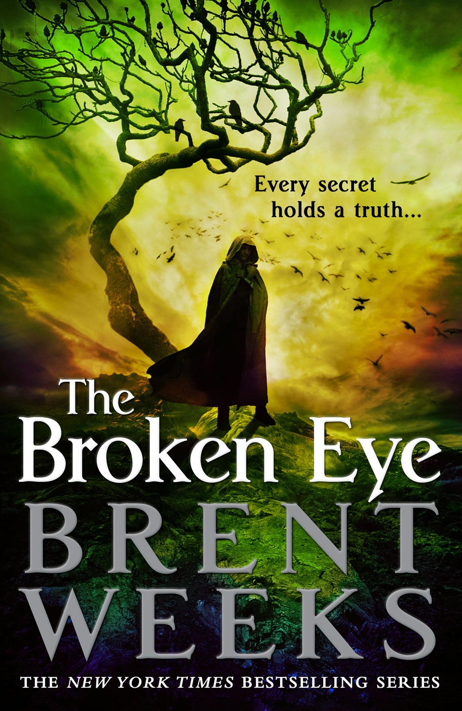
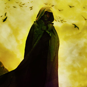


Some part of Weeks’ original (and screamingly fast) success is the result of the bold and unique (at the time, one must remember) covers for his original trilogy. Generally, a publisher is able to bring this sort of branding along with an author, but the hooded man (and the minimalist cover style) became so popular that Weeks brand was essentially stolen by the genre at large. Seriously, blame him for the hooded man, for he unleashed that demon on the world. Orbit has done a great job of evolving the look of the series to feel unique and impactfully branded, despite incorporating one of the most (nay, the most) overused tropes in Fantasy covers. The hooded man is prevalent, but the bold (and series-appropriate) splashes of colour, contrasted sharply against the black background, is striking and immediately recognizable as a Weeks book.
I spoke with Lauren Panepinto, Art Director at Orbit Books and designer of the cover, and we discussed this rebrand, the bold colour and the re-introduction of the dreaded Hooded Man. “When we originally set out to design the new Brent Weeks series, we were all over the place trying to figure out how close or how far we should be away from the Night Angel trilogy,” she said. You want to push ahead to new ground, but you don’t want to leave existing fans of the author cold. So through the early cover for The Black Prism and into the original hardcover design, I was really trying to feel my way through that.”
Despite the popularity of Weeks’ first trilogy, which, in many ways, popularized the Hooded Man, Panepinto and Orbit began moving in a different direction. Panepinto explained the initial reluctance, despite the innate popularity of Weeks’ earlier covers, “You also try to ignore the pressure of knowing a LOT of fans are going to be judging you. Big job hazard for me, as you know, ha. And clearly, in both versions, we had decided to not go with a hooded guy.”
“I had a lot easier time with The Blinding Knife. I started that cover with the guy facing front, cloak, but no hood, much more up close. Shirley Green is a great photographer and had a whole photoshoot of poses for us to pick from. And then, with Silas Manhood helping the photo illustrating, little by little, we kept zooming out, adding more of the drama of the landscape that Silas is so good at, adding more color. We really liked the cloak shapes blowing in the wind, and then we tried turned him around. It really was an amazingly organic process to get to that cover. We looked back at The Black Prism, and decided to start over, without pressure, and with The Blinding Knife as a guide, and also [began to] work on the third cover at the same time.”
We just had a hell of a lot more fun, and it shows in the images.”
Despite initially moving away from the generic Hooded Figure, Panepinto explained why they went back in that direction with this third iteration of covers for the series. “[H]onestly, we started by saying we weren’t going to use a hooded/cloaked figure, but it just was the best most dramatic composition for the landscape Silas was creating. No more controversy than that. Hooded guys may be a cliché, but there’s truth behind it that they just have more mystery and look cooler than a guy in full view. It’s a way to leave something up to the imagination of the reader.”
Leaving aside the hooded man, the gorgeous use of color is what makes this cover stand out for me.
It’s the same thing with women on covers. They might not be hooded but they’ve usually got their hair covering their face. There’s something very dramatic about a hidden face.
The tagline really bugs me. I mean, duh… secrets with no truth are called rumors, aren’t they?
Fascinating. I have to admit, though I think the hooded man is way overdone, I’m also a huge sucker for him. I like the covers on these books. I think they are nicely done. Also, props for the info from the Orbit guru. I always like getting insight into why people make the art they make for books. Very cool.