Monthly Archives: April 2010

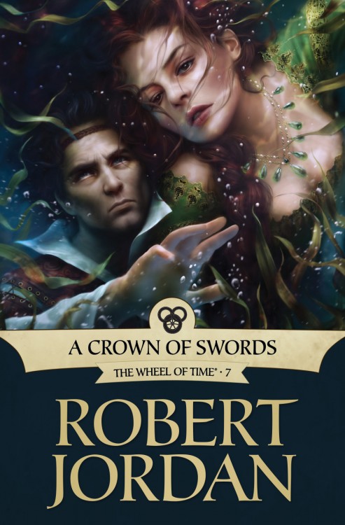
A Crown of Swords by Robert Jordan (e-book)

Another month, another gorgeous ebook cover from Tor for Robert Jordan’s The Wheel of Time. For A Crown of Swords, Irene Gallo teamed up with artist Mélanie Delon and produced a lovely rendition of Nynaeve and Lan.

Gallo on the cover:

So far we’ve been heroic, brooding, and action-packed. It was time to see something of the many relationships within The Wheel of Time. For that, we turned to Mélanie Delon to depict one of the most endearing, if tumultuous, couples in the series: Nynaeve and Lan.
I believe it was Jason Denzel that first turned me onto the scene of Nynaeve nearly drowning. He spoke so eloquently about a moment when a head-strong character had to let go of her ego to find the power within to save herself — it was impossible not to want to go read it. I loved that the sequence spoke to a clear romance in the story, but was also full of struggle and danger.

Mélanie Delon’s work is exemplified by utilizing detail and soft focus, creating images that blur the edges between realism and fantasy. It was a great match for a moment of surrender and rebirth, a moment when Nynaeve must disengage from her usual character traits and, if just for second, open herself up.

Though nothing’s been announced, I expect we’ll see the novels re-issued with the new artwork sometime after the final volume, A Memory of Light, is published. If it happens, I’ll certainly be buying new copies.

The Way of Kings by Brandon Sanderson (UK Edition)

Hrm. It’s kinda like that old Brent Weeks’ cover (which I didn’t like), had a bastard love child with the UK Mistborn covers (which I loved). I’m not so sure it works so well as Sanderson’s previous Gollancz covers. The ghostly, ethereal feel worked well with Vin (who’s rather lithe, and pretty), but feels awkward with a knight-in-shining-author.

Presumably, this is an early draft of the cover, taken from the Gollancz catalog, so, like the Weeks’ cover, it could change, but, given its similarities to the Mistborn covers and the looming release date, I expect that’s a good idea of what the final version will look like. I’m rather more fond of the US Edition.

Canticle by Ken Scholes

Frederico leaned close to smell the poison on his thirteenth wife’s cold, dead lips. It tickled his nose and he resisted the strong desire to kiss her that suddenly overcame him.

That you might lose yourself from sadness by my lips, my husband and Czar, her open, glassy eyes promised him. He looked away, uncomfortable with her empty, inviting stare.

Behind him, the Minister of the Interior cleared his voice and spoke. “The cabinet feels it would be more stabilizing to consider this an assassination. Jazrel was a most popular wife.”

Frederico nodded. She had quite a following among the young girls in Espira, the region she represented, and this was a dance he knew. He’d been in this very room three years ago to watch them cut his ninth wife’s body down.

When Sasha had hung herself with a rope of knotted silk, six thousand young women in Borut had done the same to declare sisterhood with their region’s wife.

I’m currently in the middle of Ken Scholes’ Lamentation and absolutely loving it. In my excitement, I thought it only suitable to showcase one of Scholes’ short stories set in the same world. Before releasing Lamentation, the first book of five in The Psalms of Issak, Scholes made a name for himself as a short fiction writer.

A Weeping Czar Beholds the Fallen Moon is available HERE.

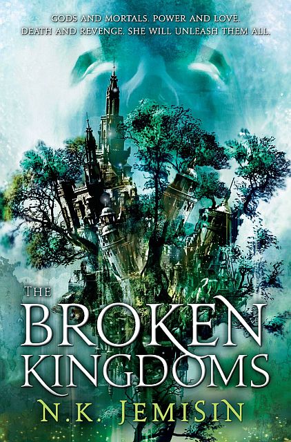
The Broken Kingdoms by N.K. Jemisin

The cover for N.K. Jemisin‘s The Hundred Thousand Kingdoms is one of my favourite examples of proving an argument against the dreaded hooded-figure. I knew I’d love the the cover for The Broken Kingdoms, but I didn’t expect to like it even more than The Hundred Thousand Kingdoms! I’m a huge sucker for blues, greens and anything to do with the forest. Plus, it’s also a nice, portentous play on the previous cover.

Cheers to Lauren Panepinto, designer, and Cliff Nielsen, artist, for setting the bar once again.

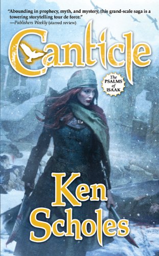
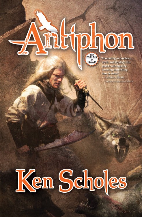
Canticle by Ken Scholes Antiphon by Ken Scholes

I’m sounding like a broken record, but I’m a big fan of Chris McGrath, the artist behind these covers. What I’m worried about, though, is that as McGrath becomes more successful, his art is starting to become its own flash-in-the-pan marketing trend. He continues to appear on more and more covers, but his style doesn’t vary a whole lot. Individually, his covers are striking and he has a knack for nailing the characters as I see them in my head, but when put side-by-side, McGrath covers all start looking the same. Can’t blame the guy for finding success, though. Jeff, at Genre Reader, feels similarly. I’m also not sure that the cartoony typography really fits the tone of the series.

On top of that, I’m a big fan of the style used on the hardcovers of Lamentation and Canticle, with lovely Greg Manchess art and a classier layout and use of typography.

Thanks to Mad Hatter for the Antiphon cover.