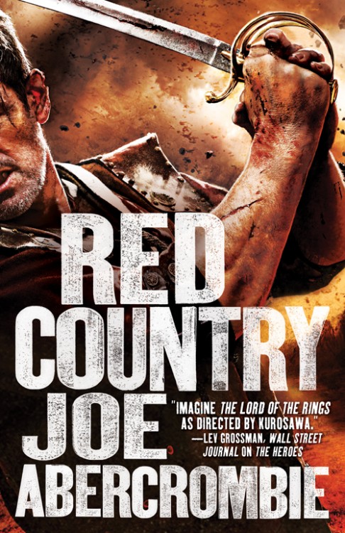
I like this new direction for the US editions of Abercrombie’s novels, even if I still prefer the UK covers. They’re well executed and take a familiar concept (dude with a sword), but inject some life into it. This will sit well along the trade paperback releases of Best Served Cold and The Heroes. So, good on Lauren Panepinto, art director at Orbit Books, for saving the series’ cover from their previous lows. I was hoping for something that would reflect the Western influence on the novel, like a pistol (do they exist yet in Abercrombie’s world?) or a dude with a mean handlebar moustache and a wide-brimmed hat, but, well, c’est la vie.
Panepinto’s brief thoughts on the cover:
I’m super excited to be able to continue our new US cover style from the trade paperbacks of The Heroes and Best Served Cold into the hardcover of Red Country. These have been the most epic photo shoots I’ve ever participated in, and Michael Frost and Gene Mollica have done an excellent job casting, styling, and producing fantastic images. The model for this shoot was particularly into the shoot, having been Pierce Brosnan’s Bond stunt double! Extra credit.
Last week, I gathered together everything we know about (A) Red Country into one handy post, so head there for a synopsis and some juicy analysis. And, if you’re into book trailers (for some reason…), you can find a short teaser for (A) Red Country at Fantasy Faction.

I literally, couldn’t disagree more. I’m a big fan of the artistic style of the original Best Served Cold and Heroes covers. I’m not a fan of photo realism. At all.
I think there is a real braindead Spartacus: Blood And Sand vibe to the new US covers. Slick, glossy and fake – entirely out of keeping with the books. Like you say, it is also a real shame they haven’t tried to incorporate anything that hints at a Western.
So Red Country versus A Red Country. Perhaps predictably I prefer the UK title but you should do a poll.
Silly cover, you don’t hold a sword that small and light with both hands.
[…] portada, por cierto, la he encontrado en el estupendo blog A Dribble of Ink y hace referencia a la edición […]
I pretty much agree with Locusmortii!
Awful; Joe’s novels are violent but with a subtlety and sophistication completely lacking here. Good job I’m in the UK, sure we’ll improve on that…..
Are those NINE fingers holding the sword?
Aye, it looks similar to a 19th century british infantry sword, the stance used in the cover is probably the worst possible, I doubt anyone ever used that type of sword in that way. That type of sword was used for single-handed thrusting, thats why theres a ruddy great fuller running along it, while this bloke was getting into this bizarre double-handed grip an opponent who was using a sword properly would have run him through under the right armpit or stuck him in the gut.
It certainly lacks the Barbarian flair of a certain MC called 9fingaz.