Posts Categorized: Art

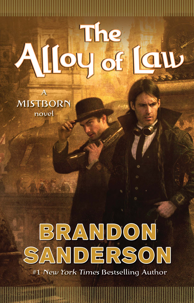
THE ALLOY OF LAW by Brandon Sanderson

Three hundred yearsafter the events of the Mistborn trilogy, Scadrial is on the verge of modernity, with railroads to supplement the canals, electric lighting in the streets and the homes of the wealthy, and the first steel-framed skyscrapers racing for the clouds.

Kelsier, Vin, Elend, Sazed, Spook, and the rest are now part of history—or religion. Yet even as science and technology are reaching new heights, the old magics of Allomancy and Feruchemy continue to play a role in this reborn world. Out in the frontier lands known as the Roughs, they are crucial tools for the brave men and women attempting to establish order and justice. One such is Waxillium Ladrian, a rare Twinborn who can Push on metals with his Allomancy and use Feruchemy to become lighter or heavier at will.

After twenty years in the Roughs, Wax has been forced by family tragedy to return to the metropolis of Elendel. Now he must reluctantly put away his guns and assume the duties and dignity incumbent upon the head of a noble house. Or so he thinks, until he learns the hard way that the mansions and elegant tree-lined streets of the city can be even more dangerous than the dusty plains of the Roughs.

A first glimpse of the cover for Sanderson’s upcoming Mistborn novel, The Alloy of Law. I like Chris McGrath, but, and I’ll be honest, I’m getting a little sick of seeing his schtick on the cover of so many novels these days; but, I can hardly begrudge a guy his popularity, right? That small complaint aside, it’s cool to see the Steampunk stylings incorporated into Sanderson’s works, and I love that even though they’ve changed artists, Tor has still managed to nicely tie the cover together with the earlier hardcover volumes of the Mistborn Trilogy.

If a cover serves any purpose, it’s to interest potential fans and excite and established ones. This cover gets me excited for The Allow of Law, so it’s a job well done, I suppose. The synopsis has me even more interested — there are few things that get me so giddy as the exploration of what happens as mysticism and magic collide with science and logic. Sanderson is the perfect author to explore that territory.

Waxillium, however, is a stupid name.
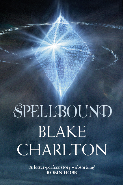
Via Charlton (and The Speculative Scotsman):

SPELLBOUND by Blake Charlton (UK Edition)

I really love the US cover for Spellbound. I mean, for a Fantasy nerd like me, what’s not to like about creamy colours, Todd Lockwood and a Dragon? Okay, maybe that font still sucks, but, hey, it’s a small complaint. In comparison, this UK cover for Spellbound is reserved and, well… kinda boring. The runes are at least an attempt to convey the language-based magic system in Charlton’s novels, but a cryptic diamond makes no promises to the reader about the excitement within.

Still, it’s a huge step up from the original cover for the UK release of Charlton’s Spellwright or the unbelievable French cover art.

*shudder*

Nicked from The Wertzone:

A fan-made map of Joe Abercrombie's THE FIRST LAW series

Since the publication of the first volume, fans of Joe Abercrombie’s The First Law were always clamouring to get a map of his world. Abercrombie, contrary as always, would not crumble under the weight of their pleas.

Since then, with Best Served Cold and The Heroes, fans have been treated to several (very beautiful) maps of various regions of Abercrombie’s world, but never the whole thing. Until now… sorta.

Using references in the text (and the map from Best Served Cold as a starting point, artist Scubamarco of Germany, has illustrated a lovingly rendered map of Abercrombie’s world that is, as far as I can tell, accurate to the text of The First Law and its pseudo-sequels (if not exact to the image in Abercrombie’s head).

If we’re lucky, an artist like Scubamarco should be snapped up quickly by the major (and smaller) publishing houses. This map’s better than a whole lot of the junk that appears in a lot of Fantasy novels.

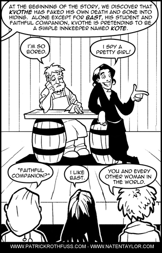
An illustrated refresh for Rothfuss' THE NAME OF THE WINDAlongside, well… everybody, I’ve been looking forward to finally getting my hands on The Wise Man’s Fear, Patrick Rothfuss’ sequel to his super-debut The Name of the Wind, for years. When I received my copy a couple of weeks ago, I dallied with the idea of re-reading The Name of the Wind for the first time since it was first released. After three years, I was understandably rusty on some of the finer points of the story. But that dalliance lasted only about 15 seconds before I cracked under the pressure and started reading The Wise Man’s Fear. I tried to hunt down a detailed synopsis but could only find the inadequate one on Wikipedia. Alas, I pushed ahead anyway.

Lucky for me, and every other reader too eager to re-read The Name of the Wind, Rothfuss, along with his buddy Nathan Taylor, has published a fully illustrated (and predictably humorous) recap of The Name of the Wind to catch us all up.