Posts Categorized: Art

TOWERS OF MIDNIGHT by Robert Jordan and Brandon Sanderson (eBook)

Holy guacamole. Raymond Swanland‘s work on Cook’s The Black Company series has always astounded me, even if it often looks samey and retreads familiar ground too often. This cover for Towers of Midnight might be my favourite piece of art by him, and, perhaps, my favourite of all the Wheel of Time eBook covers. Just the look in Perrin’s eyes is enough to make me feel a little giddy… and I’ve not even read the book!

Irene Gallo, art director for Tor.com, has similar thoughts:

Raymond Swanland was on the top of my wish-list from the begining of this project. With so few books left, I couldn’t help but to look around carefully. Still, I never realy wavered from my first impression. I knew that Raymond could handle the dramatic lighting in play and be able to invoke tremendous power in the figure work. Even assuming the best, I was still blown away by the depth of emotion he captured in Perrin. Those eyes, lost in a trance, unminding of the natural world but absolutely focused on the chaos and activity around him…. You don’t have to know the story beforehand to get shivers looking at it.

Sure beats the tepid cover for the Hardcover release.
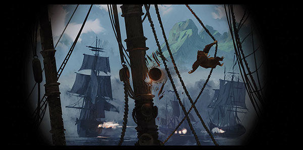
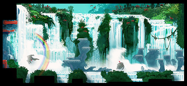
I’m a sucker for great videogame concept art. Many of the best cover artists in the business (including Kekai Kotaki, who’s near the top of the heap these days) also spend their time concepting and defining the worlds we explore in our videogames. This concept art from Donkey Kong Country Returns, my favourite game of 2010, is no exception:

Concept Art from Donkey Kong Country Returns Concept Art from Donkey Kong Country Returns Concept Art from Donkey Kong Country Returns

If you like what you see, Game Set Watch has several more pieces of concept art from Donkey Kong Country Returns.

Comments closed

Via Wired.com:

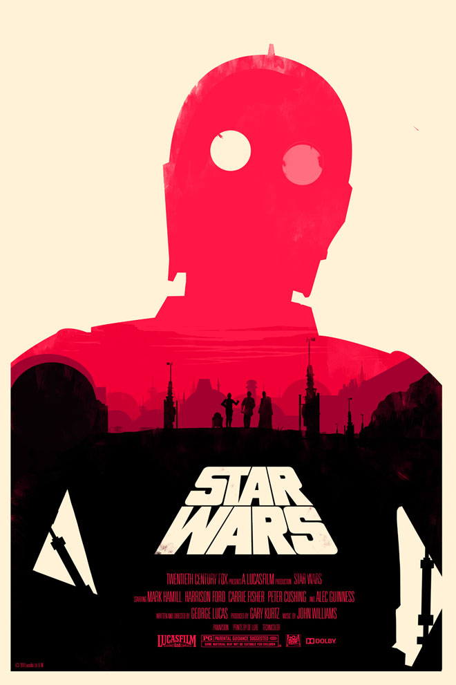
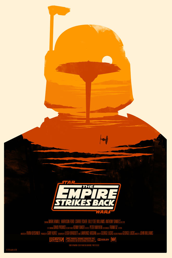
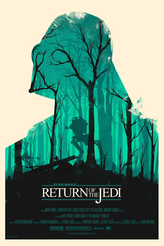
Olly Moss - Star Wars Olly Moss - Empire Strikes Back Olly Moss - Return of Jedi

These are bloody amazing. It’s not easy to make something look sharp and contemporary while at the same time embracing the retro roots of the original source material. My favourite part? The two moons of Tatooine composing C-3po’s eyes. Hell, I even think I could convince my better-half to let me hang these on the walls of our home!

More of Moss’ work and links to order prints can be found on the original Wired.com post.

Nicked mercilessly from Graeme’s Fantasy Book Review:

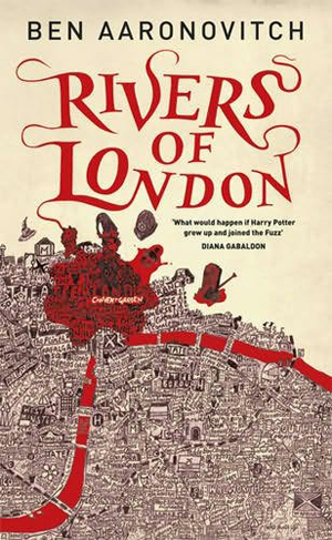
RIVERS OF LONDON and MIDNIGHT RIOT by Ben Aaronovitch RIVERS OF LONDON and MIDNIGHT RIOT by Ben Aaronovitch

Believe it or not, those two covers (each with its only wildly different title) are for the same book. See, here’s the synopsis:

My name is Peter Grant and until January I was just probationary constable in that mighty army for justice known to all right-thinking people as the Metropolitan Police Service (as the Filth to everybody else). My only concerns in life were how to avoid a transfer to the Case Progression Unit – we do paperwork so real coppers don’t have to – and finding a way to climb into the panties of the outrageously perky WPC Leslie May. Then one night, in pursuance of a murder inquiry, I tried to take a witness statement from someone who was dead but disturbingly voluable, and that brought me to the attention of Inspector Nightingale, the last wizard in England.

Now I’m a Detective Constable and a trainee wizard, the first apprentice in fifty years, and my world has become somewhat more complicated: nests of vampires in Purley, negotiating a truce between the warring god and goddess of the Thames, and digging up graves in Covent Garden . . . and there’s something festering at the heart of the city I love, a malicious vengeful spirit that takes ordinary Londoners and twists them into grotesque mannequins to act out its drama of violence and despair. The spirit of riot and rebellion has awakened in the city, and it’s falling to me to bring order out of chaos – or die trying.

It’s funny. I’d never in a million years pick up Midnight Riot if I saw it on the shelf—it looks like some sort of lame crossover between Harry Dresden and Jason Bourne; but Rivers of London catches my attention right away. I bet you can’t guess which cover belongs in the US and which is from the UK.

Just kidding.

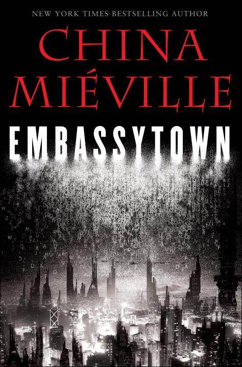
Embassytown by China Mieville

Embassytown: a city of contradictions on the outskirts of the universe.

Avice is an immerser, a traveller on the immer, the sea of space and time below the everyday, now returned to her birth planet. Here on Arieka, humans are not the only intelligent life, and Avice has a rare bond with the natives, the enigmatic Hosts – who cannot lie.

Only a tiny cadre of unique human Ambassadors can speak Language, and connect the two communities. But an unimaginable new arrival has come to Embassytown. And when this Ambassador speaks, everything changes.

Catastrophe looms. Avice knows the only hope is for her to speak directly to the alien Hosts.

Very sharp. I like the way the alphabet is raining down on the city, an obvious nod to the importance of language and communication in the novel. You can also never go wrong with red, black and white.

My biggest nitpick is that the city is clearly a manipulated photograph, and while the background buildings look suitably SF, the foreground (along with the use of the Roman alphabet) is too familiar. Would Embassytown, ‘a city of contradictions on the outskirts of the universe,’ really look like Shanghai?

Still, a nice cover in my books.