Posts Categorized: Art

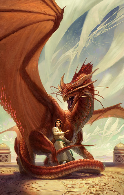
Artwork from Todd Lockwood for SPELLBOUND by Blake Charlton

From Charlton’s post on Tor.com:

The scene inspiring this cover was suggested by the lovely Megan Messinger (who was one of my valuable beta readers). For this cover, Todd and Irene faced an additional challenge. At the heart of Spellbound lies a mystery as to what, fundamentally, a dragon is in this world. It’s more complicated than you might expect. Much of the action is devoted to trying to discover and understand two hidden dragons. For this reason, when I saw the first sketches I began doing cheerleader back-flips to make sure that the cover couldn’t “spoil” the story. Through various methods that can’t be discussed without spoiling, Todd and Irene created an image that will keep the reader guessing as to exactly what kind of a creature is on the cover. Things are not as they seem.

It’s no secret that I’m a fan of Todd Lockwood. I loved his art on the cover of Spellwright… and I like this even more! Where the cover for Spellwright felt a little adolescent (due, in part, to the typeface used), Spellbound is a bit more sophisticated and adult. Nicodemus Weal, the protagonist, looks like an adult, which is also nice. Really harkens back to some of Michael Whelan’s old covers. And I *love* the creamy blue background against the red dragon. Certainly it’s Lockwood at the top of his game.

Now, let’s just hope the typeface gets a bit more tender love ‘n care than Spellwright‘s bizarre glowly, swirly font.

Update: Looks like LEC Book Reviews has a newer version of the cover with the title and author.
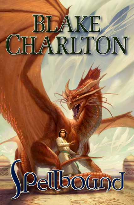
SPELLBOUND by Blake Charlton

I’m still not fond of the font, but the dark blue and lack of glow is nice, but, well, author branding and all that jazz. Lovely use of colour all around.

It’s interesting to note the loss of detail in this version, suggesting that this is an earlier version of the cover. Expect the more detailed artwork above to actually appear on the cover.
Snagged from BSC Review:

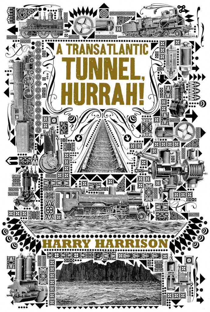
A Transatlantic Tunnel, Hurrah! by Harry Harrison

A metal highway under the sea is no longer a dream. Captain Augustine Washington and his team of navvies are already driving the tunnel under the Atlantic in an heroic feat of construction. For Gus, a descendant of the infamous George Washington, executed as a traitor after the Battle of Lexington, this is the opportunity to redeem the family name. But his beautiful fiancee has been forced to end their engagement, and there is a ruthless and sinister plot to destroy the tunnel – and Gus himself…

Man, between this and the Angry Robot Books editions of Infernal Devices and Morlock Night by K.W. Jeter, the progenitors of the Steampunk genre have sure been getting some amazing cover treatments. Yay! for old books being given a fair shake with a new audience. Hopefully we see more of this across all genres.

Cheers to the art team at Tor Books and artist Lorenzo Petrantoni.

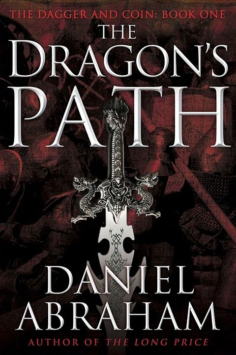
The Dragon's Path by Daniel Abraham

To top off a week-long deluge of information regarding Daniel Abraham and his upcoming The Dagger and the Coin series, we’ve got a first glimpse of early cover art for The Dragon’s Path, the first volume in the series.

The dragons are gone, the powerful magics that broke the world diluted to little more than parlour tricks, but the kingdoms of men remain and the great game of thrones goes on. Lords deploy armies and merchant caravans as their weapons, manoeuvring for wealth and power. But a darker power is rising – an unlikely leader with an ancient ally threatens to unleash the madness that destroyed the world once already. Only one man knows the truth and, from the shadows, must champion humanity. The world’s fate stands on the edge of a Dagger, its future on the toss of a Coin.

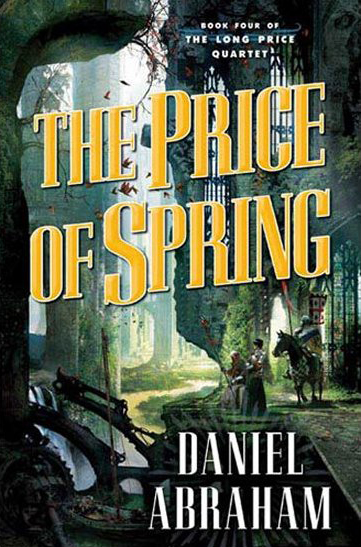
It’s from a catalogue, so likely it’s an early draft, but, well, I kinda dig it! It doesn’t blow my socks off like the Tor Books editions of The Long Price Quartet (A Shadow in Summer, The Price of Spring), but it’s succinct and ‘Fantasy’ without being over-the-top and should appeal to the Joe Abercrombie/Richard Morgan/Paul Kearney/Brent Weeks crowd, which is a very good thing, in terms of his marketability and expanding his audience. Particularly, I like the choice of classic art used in the background, rather than going with something more contemporary. It’s a small touch, but a nice one. My frothing demand for this novel grows.

If/when I get my hands on it, I’ll be sure to post the final version of the cover.

Content Warning: Transphobia — In both my original post and comments in the discussion below, I make ignorant and hurtful anti-trans remarks. They are wrong now and were wrong at the time I wrote them. I was wrong—and Mr. Newton correctly called out my ill-informed and ill-considered words. I apologize to those hurt by my words and to the wider transgender community.

Trans women are women. Period.

If you would like more information about how to support the transgender community, please visit GLAAD’s page about “Things You Can Do For Transgender Equality.” – Aidan Moher, June 27, 2020

Read More »