
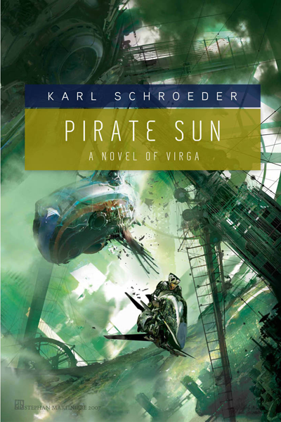
Yum. I nabbed these from Irene Gallo’s blog, and I’m wondering how I never ran across them before. I’m always a fan of Stephan Martiniere‘s art, and Jamie Stafford-Hill’s design work is the perfect companion. Just wonderful.
Yum. I nabbed these from Irene Gallo’s blog, and I’m wondering how I never ran across them before. I’m always a fan of Stephan Martiniere‘s art, and Jamie Stafford-Hill’s design work is the perfect companion. Just wonderful.
The city of Isca is set like a dark jewel in the crown of the Duchy of Stonehold. In this sprawling landscape, the monsters one sees are nothing compared to what’s living in the city’s sewers.
Twenty-three-year-old Caliph Howl is Stonehold’s reluctant High King. Thrust onto the throne, Caliph has inherited Stonehold’s dirtiest court secrets. He also faces a brewing civil war that he is unprepared to fight. After months alone amid a swirl of gossip and political machinations, the sudden reappearance of his old lover, Sena, is a welcome bit of relief. But Sena has her own legacy to claim: she has been trained from birth by the Shradnae witchocracy-adept in espionage and the art of magical equations writ in blood-and she has been sent to spy on the High King.
Yet there are magics that demand a higher price than blood. Sena secretly plots to unlock the Cisrym Ta, an arcane text whose pages contain the power to destroy worlds. The key to opening the book lies in Caliph’s veins, forcing Sena to decide if her obsession for power is greater than her love for Caliph.
Meanwhile, a fleet of airships creeps ever closer to Isca. As the final battle in a devastating civil war looms and the last page of the Cisrym Ta waits to be read, Caliph and Sena must face the deadly consequences of their decisions. And the blood of these conflicts will stain this and other worlds forever.
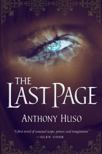
Last night, the Functional Nerds asked me for a few upcoming releases I was looking forward to. One of the first to come to mind was The Last Page, a debut novel from Anthony Huso. Lo-and-behold, a copy showed up at my doorstep this afternoon. The Last Page first caught my attention when Liviu at Fantasy Book Critic performed fellatio on gushed about it. The lovely cover certainly kept me interested in it. Lovely and iconic, I appreciate the bold splash of blue amid the browns of the cover. In the era of carbon-copy covers, I’m glad to see Huso getting some attention from Tor’s formidable art department.
Just reading the synopsis and skimming through a few pages, it gives off a kinda Mark Charan Newton-meets-Jay Lake-by-way-of-Tad Williams vibe. Not a bad first impression, by any stretch. Certainly something I’d like to get to sooner rather than later!
The Last Page will hit store shelves on August 17th, 2010 from Tor Books.
As the witch-pyres of the Spanish Inquisition blanket Renaissance Europe in a moral haze, a young African slave finds herself the unwilling apprentice of an ancient necromancer. Unfortunately, quitting his company proves even more hazardous than remaining his pupil when she is afflicted with a terrible curse. Yet salvation may lie in a mysterious tome her tutor has hidden somewhere on the war-torn continent.
She sets out on a seemingly impossible journey to find the book, never suspecting her fate is tied to three strangers: the artist Niklaus Manuel Deutsch, the alchemist Dr. Paracelsus, and a gun-slinging Dutch mercenary. As Manuel paints her macabre story on canvas, plank, and church wall, the apprentice becomes increasingly aware of the great dangers that surround her. She realizes she must revisit the fell necromancy of her childhood – or death will be the least of her concerns.
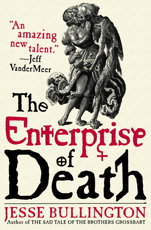
One of my favourite covers from last year was Jesse Bullington’s The Sad Tale of the Brothers Grossbart from Orbit Books. Bold and iconic, it set itself apart from other novels due to some terrific art by István Orosz.
The Enterprise of Death, Bullington’s follow-up novel, had it rough, having to follow such a strong cover and, frankly, falls a little short, thanks to the lack of such bold artwork. Still the saucy artwork (based on this art by Nicklas Manuel, who appears in the book!) is suitably macabre for Bullington’s work, and I’ve always felt that Panepinto’s work is strongest when she’s working with interesting typography. While it doesn’t have the impact I was hoping for, Bullington’s got another interesting cover on his hands.
If you’re interested, you can read my interview with Jesse Bullington, which includes more information on The Enterprise of Death and an original piece of flash fiction.
Cheer to Orbit Books and Lauren Panepinto for giving me the chance to debut this cover!
Irene Gallo, Art Director at Tor.com, on the cover:
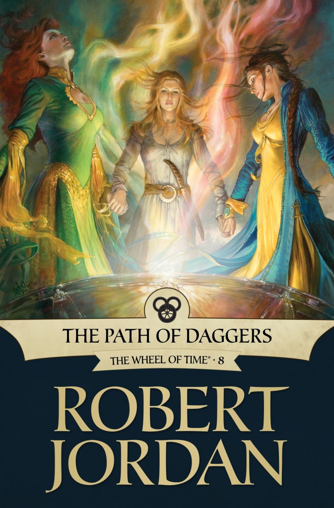
Julie Bell was on my artist wish-list for this ebook cover project right from the start. There are few artists as comfortable with figure drawing as Julie. The only question was, which book and which scene? Fairly early on, Megan Messinger had described the “Bowl of Winds” as a pivotal point in the book that focus on the strength of character and ability the women in the Wheel of Time possess. Since Julie has a hard-earned gift for painting strong women that are every bit as powerful as they are beautiful, it seemed a natural fit.
Still, some hard decisions had to be made. The scene includes thirteen women working together. If we did a long shot, we could include all thirteen, but then we loose the ability to engage with specific characters. When you add in the thumbnail-size that ebook covers are often first seen at, I thought it best to focus on a few of the key characters: Elayne, Aviendha, and Nynaeve.
The scene fell together pretty quickly after that. I have to say a special thanks to our Leigh Butler who called me in a mild panic after the sketches were approved: it seems that the clothing in the scene was described in the book before this one. Not something I ever would have caught. And further proof that the more people we let into the process, the better it is for the project.
Another winner from Tor.com, this time with art from Julie Bell. Absolutely lovely use of colour, which nicely highlights the visual elements of Jordan’s magic system. Makes me frown to think the screen on many eReaders are black and white!
From The Stamp:
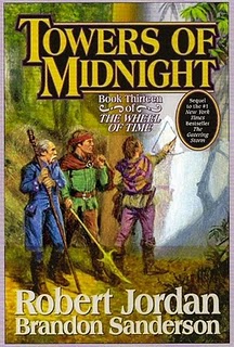
Last week, we saw a version of the cover with a juicy black bar slapped across it; not exactly the most effective measuring stick for the quality of the cover (we couldn’t see the characters, which were the biggest failing of the cover for The Gathering Storm), but it was exciting nonetheless. Now, we’ve finally got a look at the full cover (likely in progress, but much further along than the early leak of The Gathering Storm…).
Though it’s not saying much, I’d consider this one of the better covers the series has seen in a number of volumes, thanks mostly to the pretty colours. If the previous volumes have taught us anything, mediocre cover art won’t hurt the sales a lick.

