Posts Categorized: Art

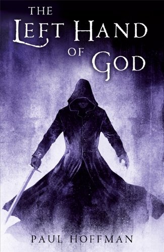
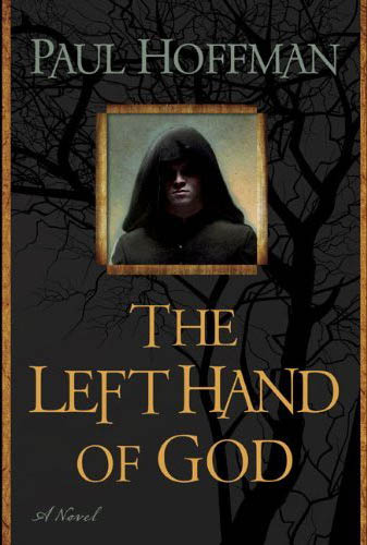
Okay, I gave the UK edition of Hoffman’s The Left Hand of God a hard time, but this is just ridiculous. Are they marketing it as a literary novel (with the inclusion the Name of the Windesque ‘A Novel’ tag) or a schlocky Fantasy novel (with the ham-fisted inclusion of a jackass in a hood)? I understand the idea that they want to hit a broad market with the release, but a complete mish-mash of styles is just as uncomfortable an unappealing as when Orbit tried it. I’m terrified that the hooded figure is looking out through a window cut from the front cover, his hood ending at his shoulders and revealing him in all his glory once you open the book.

I’m all for Fantasy novels trying to break new ground an broaden their appeal by straying away from the typical dude-in-a-hooded-cloak-fighting-an-orc-with-a-flaming-sword-and-a-castle-in-the-background covers, but if you’re going to do so, you’ve got to go one hundred percent, like Orbit’s recent re-issues of K.J. Parker’s The Engineer Trilogy.

James over at Dazed Ramblings has a similar rant about this charming cover.

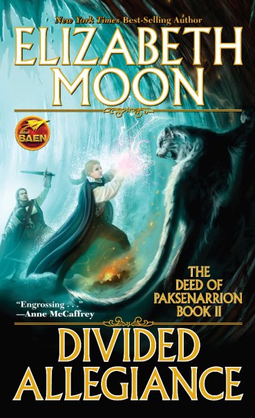
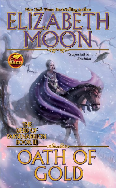
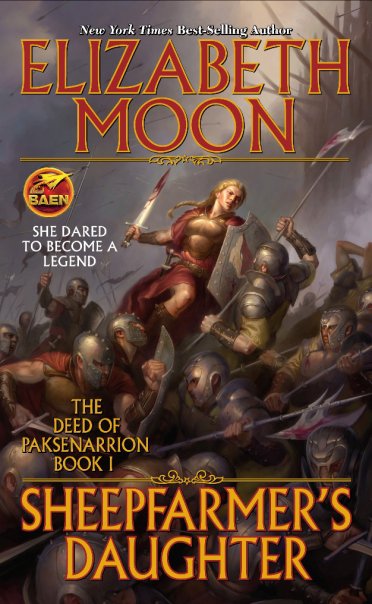
Generally, I’m not a huge fan of Baen Books‘ cover treatments, but these recoverings of Elizabeth Moon’s The Deed of Paksenarrion appeal to me in that it-reminds-me-of-being-fifteen-and-liking-badass-fantasy kinda way. Though the style of the artwork stays consistent, it’s odd that Baen would switch artists mid-way through the trilogy. Why not just commission either Harman or Lockwood to do the art for all three?

Anyone know if the books are any good?

The Sanctuary of the Redeemers is a vast and desolate place – a place without joy or hope. Most of its occupants were taken there as boys and for years have endured the brutal regime of the Lord Redeemers whose cruelty and violence have one singular purpose – to serve in the name of the One True Faith.

In one of the Sanctuary’s vast and twisting maze of corridors stands a boy. He is perhaps fourteen or fifteen years old – he is not sure and neither is anyone else. He has long-forgotten his real name, but now they call him Thomas Cale. He is strange and secretive, witty and charming, violent and profoundly bloody-minded. He is so used to the cruelty that he seems immune, but soon he will open the wrong door at the wrong time and witness an act so terrible that he will have to leave this place, or die.

His only hope of survival is to escape across the arid Scablands to Memphis, a city the opposite of the Sanctuary in every way: breathtakingly beautiful, infinitely Godless, and deeply corrupt.

But the Redeemers want Cale back at any price… not because of the secret he now knows but because of a much more terrifying secret he does not.

Paul Hoffman’s The Left Hand of God has received a fair bit of hype leading up to its release, but this little preview from The Mad Hatter that really caught my attention:

Rarely do I mention a book when I’ve only just begun, but I feel so strongly about Paul Hoffman’s Fantasy debut The Left Hand of God that I had couldn’t hold back. The amount of world-building is staggering considering I am only a few chapters in. The main character Cale has never been shown kindness living in the strictest setting imaginable yet he is still impertinent and snarky. Mark my words when this is release in the US this summer it will make waves. Right now it reminds me of The Name of the Wind only about ten times darker. If Abercrombie and Rothfuss had a baby it might write something as screwed up as The Left Hand of God. I can only hope the story keeps up to the extraordinary start, but so far the hype is well deserved. I’ll most likely do a full review when I’m done.

Abercrombie meets Rothfuss? Me likey. Shockingly standard cover with slightly-higher-than-average ambience? Me give up
Followin the nice (if slightly sterile) US cover for Shadowrise by Tad Williams, we have the equally nice (if slightly sterile) UK Cover! I like nearly everything about the design of this cover (colour scheme and font, in particular), but wish it said more about the novel it represents. It doesn’t give us eny idea of what goes on between the pages. Still, it’ll certainly look nice on bookstore shelves.

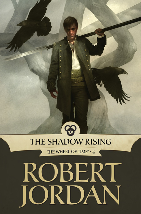
Another month, another new cover for the latest e-book edition of Robert Jordan’s Wheel of Time series. This time around it’s The Shadow Rising a volume regarded by many as one of the strongest in the cycle. Mat Cauthon, featured on the cover, is a fan-favourite, thanks in large part to the effortless humour he injected into an otherwise very serious story. What drew me to Mat, though, was the melancholy hidden just under that superficial humour. Though it may miss on the light-hearted nature of Mat, Sam Weber, the artist behind the illustration, captures that darker side perfectly by sacrificing details for mood and atmosphere.

Irene Gallo, of Tor.com, talks about the process behind the cover HERE.