Posts Categorized: Art

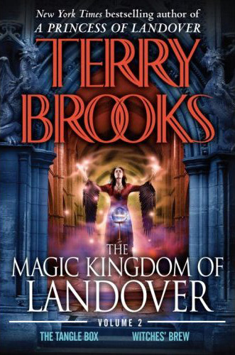
Hot off the heels of the recently released cover art for A Princess of Landover and The Magic Kingdom of Landover Volume I is the cover for the second omnibus in The Magic Kingdom of Landover series. Unfortunately it doesn’t fair as well as the other two covers.

The Magic Kingdom of Landover Volume II by Terry Brooks

As is occasionally the problem with Steve Stone’s art, this cover just comes off as too artificial. While I think the colour’s are fantastic, and there’s a fair amount of tension in the artwork, it just feels like Stone phoned this one in, without instilling much interest or charisma into the art. A shame considering how nice the other two recently released covers are.

What do you think?

Comments closed

Taken from Terry Brooks’ Official Forum:

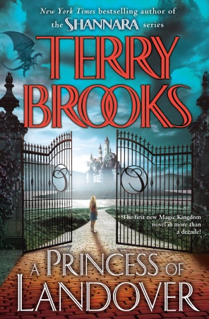
A Princess of Landover by Terry Brooks

Princess Mistaya Holiday hasn’t been fitting in too well at Carrington Women’s Preparatory. People don’t seem to appreciate her using her magic to settle matters in the human world. So when she summons a dragon to teach a lesson to the snotty school bully, she finds herself suspended. But Mistaya couldn’t care less – she wants nothing more than to continue her studies under Questor the court magician and Abernathy the court scribe. However, her father Ben Holiday, the King of Landover, has rather different plans in mind for her. He thinks he’ll teach her about perseverance and compromise by sending her to renovate Libiris, the long-abandoned royal library. How horribly dull. But before long, Mistaya will long for the boredom of cataloguing an unfeasible number of derelict books – for deep within the library there lies a secret so dangerous that it threatens the future of Landover itself …

I love it. Simple, I suppose, but the colours really seal the deal for me. Steve Stone’s artwork can be hit or miss when it comes to Fantasy covers, but this one works for me. Much better than the bland UK Cover art.

Or maybe it’s just my inner Terry-Brooks-fanboy coming out. What do you think?

Orbit Books is re-releasing Jeff Somer’s novels, The Electric Church, The Digital Plague in Mass Market Paperback, and decided new covers were in order:


The Electric Church by Jeff Somers The Digital Plague by Jeff Somers

Along with those two is the cover for his third novel, The Eternal Prison, due in Trade Paperback in Fall 2009, with a MMPB version to follow in Spring 2010:

The Eternal Prison by Jeff Somers

As is their habit, Orbit goes into detail about the creation of the new covers:

For your viewing pleasure, this week I present the brand-spanking-new mass Market versions of THE ELECTRIC CHURCH, THE DIGITAL PLAGUE, and THE ETERNAL PRISON by Jeff Somers. The original trade paperback covers (design by Keith Hayes, art by Jae Lee) are some of my favorite Orbit covers, but we decided to shake it up a bit for the mass market releases. This series is a noir detective story set in an apocalyptic future, and its cyberpunk feel simultaneously reminded me of a William Gibson book, Blade Runner, and some of my favorite video games.

Jeff’s books sold well in trade paperback, but he’s a new author with a great voice, so we’re releasing him again in mass market to give him a chance to pick up new readers who may be willing to take a chance on a new author at a cheaper cover price. Since that’s the case, it only makes sense to redesign the covers — if a reader saw the original covers and really loved them, it’s implied that they picked up the books already, so why not go after the readers you missed? This works well in the case of this series, because the original covers, though gorgeous (in my opinion), were a little quiet. By quiet, I mean, they didn’t tell you just from the cover exactly what you could expect from the book. These books mix Jason Bourne — level action with Matrix-style apocalyptic futurism. Hopefully people who are interested in reading that kind of thing will see these covers and go “oooh, fun” and pick them up.

The original covers can be found HERE. I have to say, thought the originals were nice, these ones knock them out of the water! I’m a big fan of the bold, single colour design.