Posts Categorized: Art

From Tor.com:

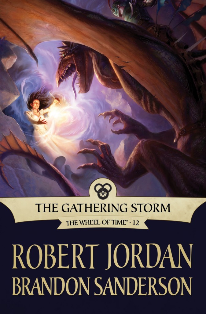
The Gathering Storm by Robert Jordan and Brandon Sanderson

It’s more generic than many of the other covers, and doesn’t scream Wheel of Time like some of the others, but still a nice piece of artwork. It’s strange seeing a creature on the cover, given Wheel of Time‘s proclivity towards conflict between humans (or at least humanoids). That said, I’m unfamiliar with the scene in the novel, so it could be an obvious choice to those who’ve read The Gathering Storm.

One thing that always impresses me about Lockwood, and isn’t immediately apparent when looking at his art, is that he’s a digital painter. Unlike many who work in the medium, Lockwood’s art looks like it’s hand painted and avoids that uncanny valley that artists like Jon Sullivan fall into. His use of colour, as always, is wonderful. There’s a great video showing Lockwood’s progression as he works through the painting for The Gathering Storm:

Another nice cover, if not the best in the series.
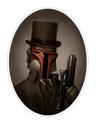
Snagged from LA Weekly:

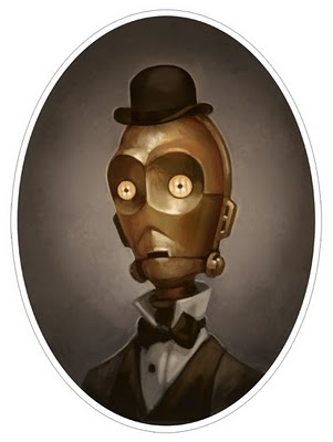
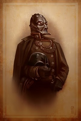
Boba Fett, by Greg Peltz C-3P0, by Greg Peltz Darth Vader by Greg Peltz

Beautiful Victorian-style portraits? Check. Star Wars characters? Check. Artist behind some of my favourite films of all time? Check.

Seriously, what’s not to like about these portraits from Greg Peltz? Love the stylized look of them, love the little details that perfectly capture the characters (Darth Vader holding his helmet? Genius.)

You can find more of the Star Wars portraits on the LA Weekly blog.

Orbit's Chart of Fantasy Cover Art 2009

Last year, Orbit Books had a bit of fun by rounding up a huge swathe of 2008’s Fantasy novels and compiling a graph of the cliches used in the art. Now, they’re back at it, taking a look at the covers for 2009’s novels and comparing them against the novels in 2008.

It’s interesting to see that nearly all the categories dropped off (Maps, Hobbits/Dwarves/Trolls/Ogres, and Guns are the only categories to see an increase in 2009), suggesting, perhaps, that we actually saw a bit more variance in the cover art released in 2009. I think we’re all shocked by how low Hooded Figures ranked; though, if they took out the ‘hooded’ part and added in ‘hired college student wearing a cloak, labelled with a tramp stamp and/or looking menacing‘ to the list, I’m sure it’d rank near the top. I do like those ‘dark covers of meaningless’, though. We could use more of them, and maybe even add in a ‘light cover of meaningless’ or a ‘colourful cover of meaningless’ while we’re at it.

It’s an interesting, humourous look at the trends in the industry. It certainly shows that cliches are alive and well in the hearts of readers and the minds of graphic designers and marketers everywhere. Also of note is that Orbit Books will be compiling a similar graph based on the titles of novels released in 2009, which should be of equal interest.

From Roberts’ blog:

By Light Alone by Adam Roberts

In a world where we have been genetically engineered so that we can photosynthesise sunlight with our hair hunger is a thing of the past, food an indulgence. The poor grow their hair, the rich affect baldness and flaunt their wealth by still eating. But other hungers remain . . . The young daughter of an affluent New York family is kidnapped. The ransom dermands are refused. Years later a young women arrives at the family home claiming to be their long lost daughter. She has changed so much, she has lived on light, can anyone be sure that she has come home? Adam Roberts’ new novel is yet another amazing melding of startling ideas and beautiful prose. Set in a New York of the future it nevertheless has echoes of a Fitzgeraldesque affluence and art-deco style. It charts his further progress as one of the most important writers of his generation.

You know how I like to complain about cover art being boring, derivative and blandly figure-centric? Well, you won’t be hearing any of those complaints today. Lovingly kitschy and spot on for the tone and setting of the novel.