Posts Categorized: Art

From Tor.com:

Knife of Dreams by Robert Jordan (eBook)

It was time to pump up the action on the covers. I knew early on I wanted to ask Michael Komarck to work on the series but I wasn’t sure which book. After talking to Jason Denzel and reading some of the fan comments, it seemed Komarck’s gritty photorealism would be a perfect fit for this sequence.

At this point in the series Rand’s physical and mental stability is breaking down. Komarck’s tight composition and unconventional angles make the viewer feel that imbalance. Komarck engages you by making you feel slightly uncomfortable, almost wishing you could take a step back to regain your composure.

In an age when a lot of noise is being made about illustration “needing” to become moving images, I would say the beauty of this image is that you are in perpetual conflict—you want Rand to regain balance, but no amount of looking will change his struggle at that moment.

Since his work on George R.R. Martin’s A Song of Ice and Fire, Michael Komarck has become one of my favourite Fantasy Illustrators working in the industry. If put in Irene Gallo’s shoes, of choosing the artists involved in the Wheel of Time eBook re-issue, he would have been one of my first choices. I mean, just look at this Lord of the Rings painting.

I’m a big fan of the Knife of Dreams cover. Great physicality, emotion, colours, contrast. Just awesome. Plus, Rand actually looks like a man in the painting, as opposed to a teenager or a boy, as befits his transformation through the series. Great stuff from Gallo, Komarck and the rest of the Tor Books art team.
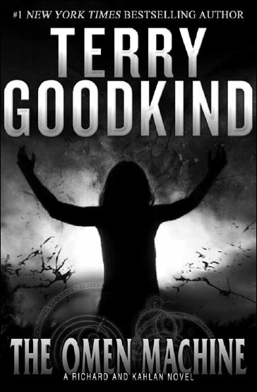
The Omen Machine by Terry Goodkind

RARGHRGH. Angry Giant Kahlan is angry. RARAGRHG! This is the cover that Terry Goodkind, apparently, helped design. Looks like an ordinary, generic cover. I expected more moral objectivity, beards, Ayn Rands and Goodkind’s name to be even larger and foiled in 22k gold. It is appropriate that Angry Giant Kahlan appears to be worshiping Goodkind’s name, though.

Terry Goodkind’s novels of the Sword of Truth series set a new standard for epic storytelling in a fully realized world. Now Goodkind returns to that world for a new cycle of tales, centering on Richard Cypher and Kahlan Amnell. The Omen Machine begins directly after the events of the Sword of Truth, but it starts an independent storyline. Readers who haven’t experienced the Sword of Truth novels can begin here, while longtime fans will be captivated by a new tale of the characters that fascinated them before.

Hidden deep underground for millennia, discovered only by chance, the mysterious machine has awakened, to begin issuing a serious of ominous and alarmingly accurate omens. As the wizard Zeddicus attempts to destroy the sinister device, it issues a cataclysmic omen involving Richard and Kahlan, foretelling an impending event beyond anyone’s ability to prevent it. With catastrophe imminent, the machine then reveals that it is within its power to withdraw the omen…on fulfillment of an impossible demand.

I love that it’s ‘a Richard and Kahlan Novel‘. I guess the ship has sailed on the Sword of Truth Series, though how this is anything but the 14th volume is a mystery to me. I mean it’s got Kahlan, Richard, Zeddicus, Prophecies, Omens (and Machines!), Valour, Heroism, (likely) jaw kicking and sadomasochism, and it picks up directly after the end of Confessor. Totally sounds like a new series to me.

Glibness aside, with all the Imperial Order junk out of the way, it does sound like it might recapture some of the fun and adventurousness that made the early novels in the series readable and, *gasp*, enjoyable. At least he’s not trying to hide it as a literary thirller this time around.

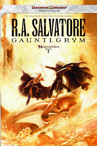
Gauntlgrym by R.A. Salvatore

A few months ago I posted a cover for Gauntlgrym by R.A. Salvatore, the 7,345th volume in the Drizzt Do’Urden Saga. Turns out that was just placeholder art (likely for a catalog) and Wizards of the Coast was still working on the real cover.

It’s not my favourite artwork from Todd Lockwood, but it’ll surely appeal to its audience. For some reason, I get no sense of inertia or energy from the painting, it all just seems so static and lifeless to me, like a piece of sports photography shot at too high a shutter speed.

On the plus side, that title still makes me laugh, and I liked Neverwinter Nights when I played it years ago, so the setting might be cool. Still, I left Drizzt and co. behind many, many volumes ago.

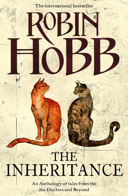
The Inheritance by Robin Hobb (UK Edition)

It’s, uhh… catastic? I dunno. I wasn’t a fan of the style when there were Dragons involved, and I’m not really any more keen on it now. Just seems like a strange marketing decision. I do appreciate the consistency in style, though. Long gone are the days of wonderful John Howe art gracing the covers of Hobb’s work.

That said, though it’s an odd fit for this book cover, artist Jackie Morris does have a wonderful portfolio of art, and it’s absolutely worth visiting.

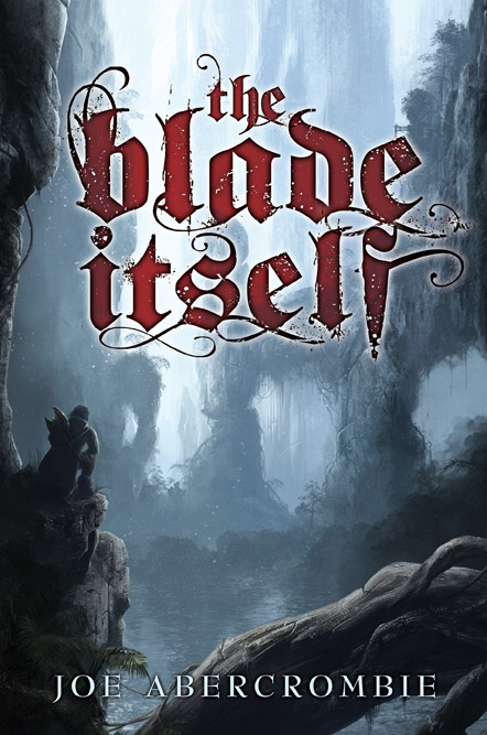
Cover Art for the limited edition of The Blade Itself by Joe Abercrombie

Yummy art? Over-the-top typography? It must be another great Subterranean Press cover! I’ve been waiting for this for a while, and it’s certainly no let down. Sure, it doesn’t have share the stylistic approach of Abercrombie’s general releases (which I still prefer), but it’s a great, moody piece of art that shows a different side of Abercrombie’s series. I’m particularly fond of the deep red font contrasting the cool blue hues of the art.

It’s interesting to see Alex Preuss‘ style veer more towards Fantasy in this piece, given that some people (myself included) felt that the recently released interior artwork felt too much like an image you’d find in a Science Fiction novel. It speaks to a nice diversity, and I can’t wait to see the rest of the artwork.

Opinions? Any guess what the scene of the cover conveys?