Posts Categorized: Art

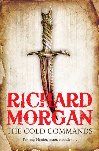
The Cold Commands by Richard Morgan (UK Edition)

I was, frankly, hoping for something a bit, well, colder, I have to admit. For a novel called ‘The Cold Commands‘, there’s certainly a lot of warm reds, oranges and browns. Still, I like the style of the cover, which takes its cue from the paperback release of The Steel Remains (which, frankly, would better suit The Cold Commands, with its cool colours.) Should look pretty once they print it with nice, shiny foil, like The Steel Remains.

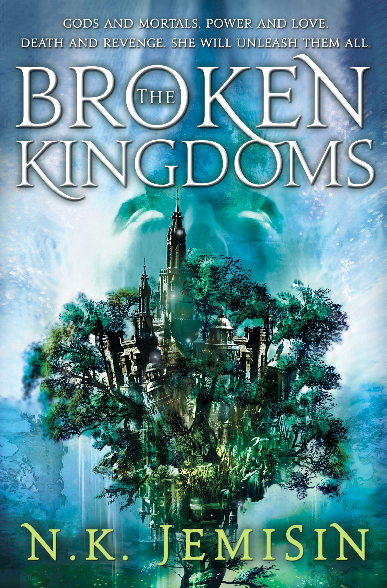
The Broken Kingdoms by NK Jemisin

A few months ago, I raised a bit of a stink by posting a leaked version of the cover for N.K. Jemisin’s The Broken Kingdoms. Oops. I thought it was awesome, and most people agreed. Now, we get a look at a new, revised (and final) version of the cover. New layout for the type (which I’m not a fan of, I liked the more traditional layout on the early cover) and the colours seem to pop a bit more. Still a damn fine cover.

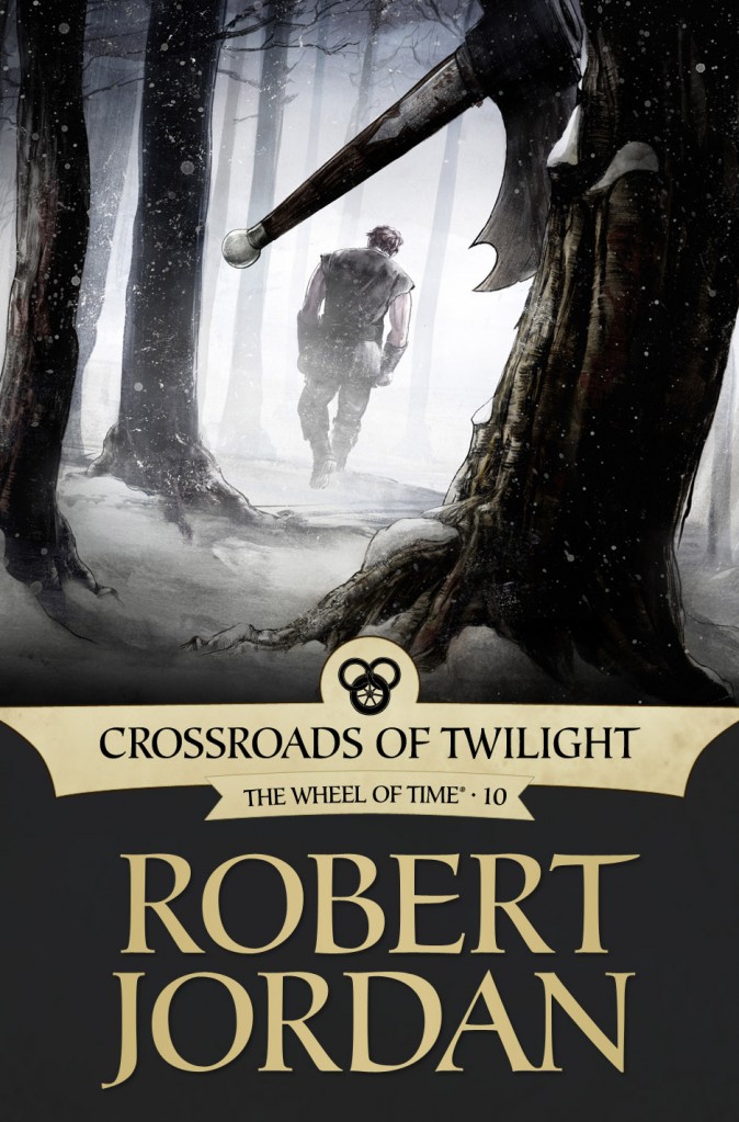
Crossroads of Twilight by Robert Jordan (eBook Edition)

From Irene Gallo, at Tor.com:

With Crossroads, we wanted to show Perrin at his breaking point. After engaging in a despicable act he, in a fit of justifiable rage, finally chooses to throw away his axe of war. The trick was getting the moment right. Attempts to show the action came across a bit cartoony. Instead, we decided to depict the minutes just after. The point was to show what Perrin, in this character-defining moment, was leaving behind.

Striking the right emotional chord through mood and atmosphere would be no easy task. According to artist Greg Ruth, “There’s a time in winter here in New England where it’s early in the woods and the canopy of trees keeps the snow from getting too high on the ground, but it’s cold as hell and so deathly quiet. I loved the idea of trying as best as I could to convey that silence and chill as a kind of indictment on the bloody events that precede this scene. If the idea was to get the moment after the action, then the world surrounding the figure and the axe had to convey the emotion as much or more than anything else. Capturing that particular lighting was tough.”

The story of Wheel of Time is a fabric of profoundly difficult and personal decisions. In the end, Greg Ruth created a moment when a giant hero with the weight of the world on his shoulders is at his own private crossroads.

Greg Ruth‘s sumi-e styling is initially a little startling, giving the cover a bit of a cartoony, comic book feel, but as I look at it longer the heavy contrast between the white snow and the dark shadows fits the emotional tone of the scene depicted. I also love how we see Perrin through the arc of his axe, such an iconic image for his character.

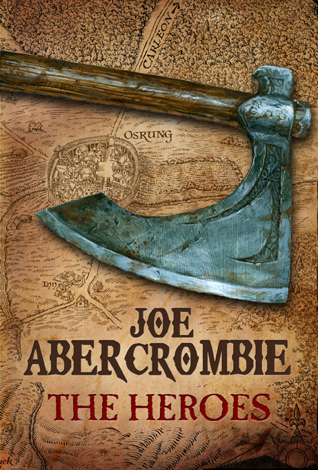
The Heroes by Joe Abercrombie (UK)

The UK releases of Joe Abercrombie’s novels are known for having some of the most iconic, beautiful covers in the genre, especially when put against the bland, lookalike covers pasted on the front of most novels being published today. So, kudos once again to the art team at Gollancz, for sticking to their guns and producing a fifth cover that’s just as lovely as the previous four. It fits Abercrombie’s style to a ‘T’, and looks like a book I’d be forced to pick up from store shelves (which I can’t say about the bloodtastic US cover, though it’s an improvement over Best Served Cold).

Plus, it’s got a map. I love maps.

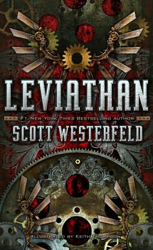
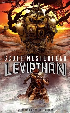
Leviathan, Scott Westerfeld‘s Steampunk/Biopunk take on World War I, was one of my favourite novels from last year. Not only did Westerfeld meld our real world history in with giant Mechs and floating whales-turned-zepplins, but it was also flush with gorgeous artwork from Keith Thompson, perfectly rendering Westerfeld’s vision of Germany, Switzerland and Austria, et al on the eve of World War I. On top of this, it had terrific cover art, which convinced me to buy the novel in the first place.

Leviathan by Scott WesterfeldLeviathan by Scott Westerfeld

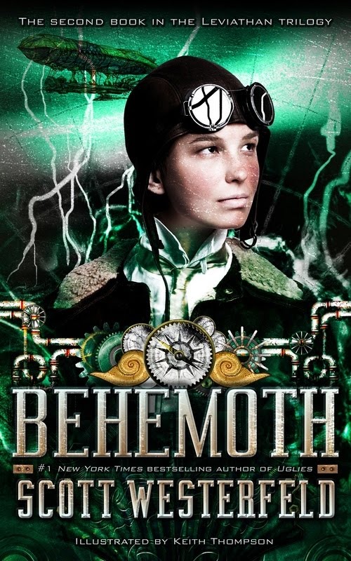
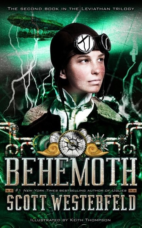
So, it comes to reason that I was bloody excited about the cover to the sequel, Behemoth, which is set to come out later this year. Then, I stumbled across it on Stomping on Yeti, and a little piece of my soul died.
Behemoth by Scott Westerfeld

Really? Really?!

All that amazing artwork… and we get a photograph of a seventh grader from Tuscon, Arizona? Is he dressed up for one of those Olde Tyme photobooths at a fair? And that slimy lightning? The bottom half of the cover, which falls in line with the previous release, is good… but, seriously, way to miss the mark of what made Leviathan so compelling to pick up off the shelf. At least Thompson is still on board to provide the artwork inside, it’s sure to be wonderful again.