Posts Categorized: Art

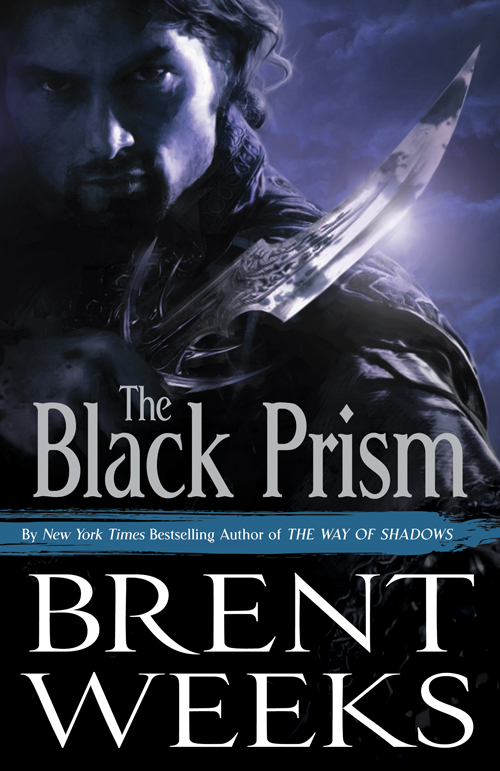
The Black Prism by Brent Weeks
Artwork by Richard Jones

Gavin Guile is the Prism, the most powerful man in the world. He is high priest and emperor, a man whose power, wit, and charm are all that preserves a tenuous peace. But Prisms never last, and Guile knows exactly how long he has left to live: Five years to achieve five impossible goals.

But when Guile discovers he has a son, born in a far kingdom after the war that put him in power, he must decide how much he’s willing to pay to protect a secret that could tear his world apart.

A few months ago, I raised a bit of a stink when I stumbled across a leaked cover for Brent Weeks‘s The Black Prism. My main criticism about the cover wasn’t so much the quality of the artwork, the layout of the typography or the general tone of the cover, but rather that it looked exactly like Weeks’ previous series, The Night Angel Trilogy, which is completely unrelated to The Black Prism. Now, fast forward a few months and we have this, the revamped cover for The Black Prism that seems to finally hit the nail the previous cover was going for.
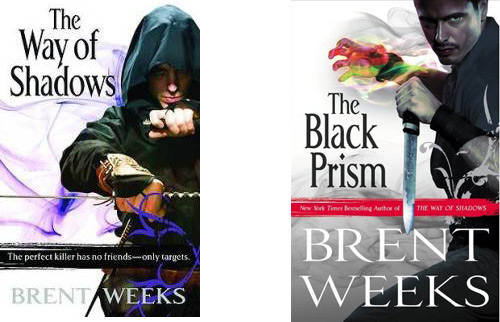
A comparison of Brent Weeks covers

Lauren Panepinto, the designer, on the cover:

Your friendly neighborhood Creative Director here really had a hard time balancing how much to show, what tone the cover should have, what the color of the cover could be (hint, hint), and still remain true to the story and world inside. We must have gone through a thousand poses, color and lighting treatments, and crops. Debate raged for months over this one, as some of you heard about when a prior version of the cover was unofficially released. What was great was so many people were involved in the development of this cover, and so much feedback was taken into account, that I think we’ve really nailed this cover for a book which we hope will blow you away both inside and out.

While I’m not always a fan of the super-realistic digital painting technique used for the art (at least on covers, artwork using the style can be quite striking), I applaud the Orbit team for coming up with a cover that manages to identify with Weeks’ previous novel without resorting to completely emulating it. If there’s anything I’ve learned since the first cover was leaked, it’s that familiarity, and creating a brand for an author (especially one as immediately successful as Weeks) is important for continued success and making sure that Weeks’ fans, the casual ones in particular, can find the book as easily as possible.

I may not love this cover, but I appreciate that Orbit was willing to take a step back and consider some of the feedback generated by my post and others like it.
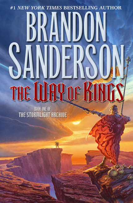

The Way of Kings by Brandon Sanderson

Whelan’s thoughts on the cover:

When I received the manuscript from Tor I was somewhat dismayed. 1400 pages! I felt that it would be tough sledding to work my way through such a massive fantasy epic.

As it turned out, though, I was soon hooked and lost in the world Mr. Sanderson so skillfully realized. It helped that the writing had a rich cinematic quality that brought images of scenes, characters and creatures to my mind as if I were immersed in a Myst-style virtual reality adventure, or watching a movie.

That was fun to read, but it made my work for the cover art very difficult indeed. How can one successfully distill enough of this novel to possibly do justice to the book with one picture? It was a steep challenge.

I’m an enourmous, slavering, hopeless Michael Whelan fan. I love the way he embraces scope. I love the way he uses colour. The cover for The Way of Kings is classic Whelan. I’m also charmed b is how involved he gets in the cover process, reading the novel before setting to work on the cover. Great detail, down to the forbidding storm cloud swallowing the sunlight, in reference to the overall title of the series, The Stormlight Archives.

Mr. Whelan’s been missed and it’s nice to back, if only for a one shot deal.

Version 43 by Philip Palmer

The Exodus Universe.

Your odds of surviving quantum teleportation are, more or less, fifty/fifty. The only ones crazy enough to try it are the desperate, the insane, and those sentenced to exile for their crimes.

Belladonna is home to the survivors of the fifty/fifty—and is therefore a planet run by criminals and thieves. But when a horrific and improbable murder catches the attention of the Galactic Police force, one cyborg cop—Version 43—is sent to investigate.

Version 43 has been here before and has old friends and older enemies lying in wait. The cop was human once, but now, he is more program than man and will find a way to clean up this planet once and for all.

Another solid cover for Philip Palmer from the folks at Orbit. Like its predecessor, I’m sure this will be a love-it-or-hate-it cover. While I don’t like it quite as much as the cover for Red Claw, I still applaud Orbit for going ahead and making the bold decision and not covering Palmer’s books with images that look like every other Science Fiction novel out there, it’s something I’d like to see more publishing companies attempt. As with Red Claw, I love the faux-60’s look, which reminds me greatly of Thunderbirds (or Fireball XL5).

Over on the , Lauren Panepinto has gives a nice peek into the creation of the covers and the ‘branding’ of Philip Palmer and his novels.

Previous entries in this re-imagining of Abercrombie’s covers have come under fire for featuring too-pretty portrayals of his famously violent characters. And, really, should a man called ‘The Cripple’ really look this good? How about a scarred and battle-worn Barbarian? Still, this time around you have playboy Jezal Dan Luthar adorning the cover, and he’s anything but ugly in the text of the novels (though they’ve left out a certain scar attained by our pretty-boy in Before They Are Hanged.) I’m a fan of Chris McGrath, the artist, and generally like the set of covers, but it’s an odd decision to go with a trio of handsome (if slightly grizzled) figures that more or less completely miss the point being made by Abercrombie and fail to capture the tone of his work. War is ugly, mates, you just wouldn’t know it from these covers.

Complaining aside, I do like the general design of the covers and the artwork is among McGrath’s best. These will no doubt look quite sharp all lined up in a row on a bookshelf.

Thanks to The Mad Hatter for the heads up.