Posts Tagged: A Dribble of Ink

Hugo Awards Logo

On Saturday, April 19th, the 2014 Hugo Award nominations were announced, and I’m proud to announce that A Dribble of Ink is represented in two categories: Best Fanzine and Best Related Work.

Best Fanzine

Alongside The Book Smugglers*, Elitist Book Review, Journey Planet and Pornokitsch*, A Dribble of Ink is in the running for Best Fanzine of 2013. If you’ve followed my writing for any time, you’ll know that I’ve long been critical of this category for dipping its pen into the same inkwell too often, so I’m thrilled to be included on a ballot that is guaranteed to see a new winner.

On that note, I expect to get crushed by Pornokitsch and/or The Book Smugglers, but it’ll be fun competition between these friends of mine regardless. Read More »

As you’ve no doubt noticed, things look a little different around here today.

For the past several weeks, I’ve been hard at work designing, developing, and building a brand new look and feel for A Dribble of Ink. 2014 promises a big transitional year for me, both personally and here at A Dribble of Ink, and I felt like there was no better way to celebrate that than to apply a fresh coat of paint, introduce some features I’ve been excited about, and, generally, increase the level of the site to bring it a few steps closer to the vision I have for it moving forward.

I think this is the best, cleanest, and most professional iteration of A Dribble of Ink yet, and hope that it encourages you to visit more often, join the conversation, and spread word to your friends, families, co-workers (and anyone else you chat to about science fiction and fantasy.)

In addition to the visual overhaul, there are a couple of things that I’d like to draw attention to. Read More »

Foz Meadows, contributing review for A Dribble of InkI’m happy to introduce Foz Meadows, the newest contributing reviewer here at A Dribble of Ink. Foz joins Justin Landon as a contributing reviewer and will be publishing monthly reviews covering a wide range of novels. You might recognize Foz’s work from her own blog, Shattersnipe, her contributions to the Huffington Post, and her past writing here at A Dribble of Ink, including yesterday’s essay on escapism and privilege in Fantasy and Science Fiction. The Book Smugglers, in discussing their choices for the 2013 ‘Best Fan Writer’ Hugo award, described Foz as having ‘written some of the BEST blog posts and articles last year addressing sexism, racism, problematic narratives in Fandom and in YA, all in relation to SF,’ and I’m incredibly proud to bring a writer with such pedigree to A Dribble of Ink.

I was first introduced to Foz’s writing last year after recommendations from several other critics and blogging friends. Her reviews and commentary are sharp, insightful and intelligently engage with many of the important issues being discussed in the overall SFF discussion. For a proper introduction to Foz’s writing, I encourage you to check out her 2012 Year in Review. I feel that adding Foz to the team at A Dribble of Ink will continue to expand and add variety to the areas of coverage and topics of conversation covered, which, in this editor’s opinion, is a very good thing.

So, then, here’s to Foz.

3point0

Welcome to the latest version of A Dribble of Ink!

Last March, I launched a new template for A Dribble of Ink. Being a web developer/designer by day, I enjoy fiddling around with my template and continuing to evolve the look, feel, features and functionality of A Dribble of Ink. With a new spring, I felt like it was time to revisit my template and continue that evolution. This time around, however, I’ve done an entire from-the-ground-up rebuild of the theme, rather than the small tweaks and visual changes that I normally make. You might notice that the visual identity of A Dribble of Ink hasn’t change drastically from the previous theme. This is intentional. I still like the look of the old template, so instead of spending time re-inventing the wheel, I’ve updated and evolved the look. The real heavy lifting comes in some of the behind-the-scenes features that will make it easier for me to maintain A Dribble of Ink (loads of custom post types, allowing me to get creative with featured articles and reviews, and automating some things), and more enjoyable/easier for you, the readers, to read and interact with the blog.

The main purpose of the previous redesign was to increase site speed. This redesign focusses on improving user experience with a simpler layout, and by embracing the shift towards responsive CSS3/HTML 5 layouts. What does this mean? Well, in years past, it was likely that you’d be reading this blog post on a computer screen. Nowadays, however, a large portion of my readers come to the site on computers, tablets and phones. So, this new theme is designed to adapt itself dynamically to whatever screen a reader is viewing it on.

On a phone it looks something like this:

A Dribble of Ink Mobile

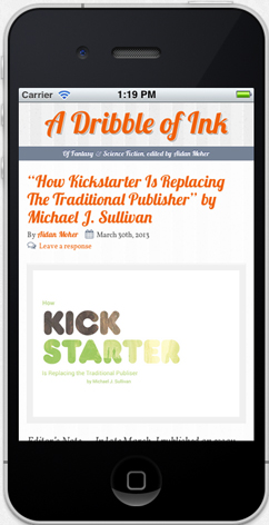
Same code. Same content. Fun times.

I’ve also tried to keep it as consistent cross-browser, though there are always compromises that must be made in these situations. If you want to experience all the new fun stuff, and have A Dribble of Ink look its best, make sure you’re using a modern browser like Chrome or Firefox. Most of my readers do so already, according to my web analytics. It’ll work just fine in Internet Explorer 9+, but Microsoft are a little behind the curve in integrating the new HTML5 and CSS3 features, so it’s impossible to replicate all of these features.

I hope you like it. I’d also love to hear from you. Last time around, reader feedback was extremely helpful in terms of layout improvements, polish and bug fixing, so, if you have suggestions, please feel free to (kindly) provide feedback in the comments section here. I’m sorry if you still don’t like orange.

Just a quick note about the recent launch of version 2.1 of A Dribble of Ink. Many of you have probably noticed (and if not, hit refresh on your browser) that I’ve updated the template of the blog. Instead of a major revision, like the one that happened in March 2012, and focussed on a from-the-ground-up redesign, this revision focuses on some minor visual updates (new body font, tightening up of layout, sticky header), some major overhauls to the back-end (that you won’t see, but make life much easier for me), and a great new system for displaying and promoting the various guest writers that I host from time-to-time. So, take a look around, I hope you like it!