Last time I visited A Dribble of Ink, I wrote about worldbuilding in the air and monsters. Aidan asked me to return and talk about food in fantasy, which I do fairly regularly for my interview series Cooking the Books.
Running a food-oriented interview series makes me think really hard about food in every book I write, including Updraft (Tor 2015), because I don’t want to suddenly have a cow-based product (like milk) appear in a world that has not seen a cow in forever, and where a cow would have to scale a sky-high tower made of bone to get that milk there. NO that would be bad and has never happened, ever. (Thank you again, brilliant copy editor Ana Deboo, for, ehrm … Completely Unrelated Reasons.)
So when Aidan asked, I began to think about those Fantasy Foodies who get it right — and who make our mouths water in the process. Here are thirteen of my favorites (there are many more, but the list grew unmanageable), in alphabetical order, and I’ve given you some amuse-bouche quotes to go with them. Read More »
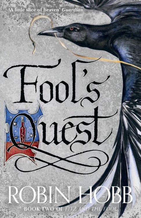
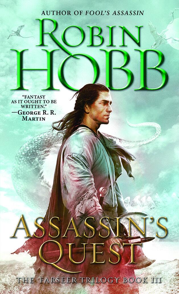
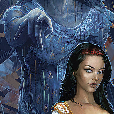
Robin Hobb revealed the cover art for the UK edition of Fool’s Quest today, and it’s very pretty. I really like the way Jackie Morris‘ art has come into its own and helped to define this series. I wasn’t always a fan, but this is gorgeous and Hobb’s books are some of the most recognizable on UK shelves. Great all around.
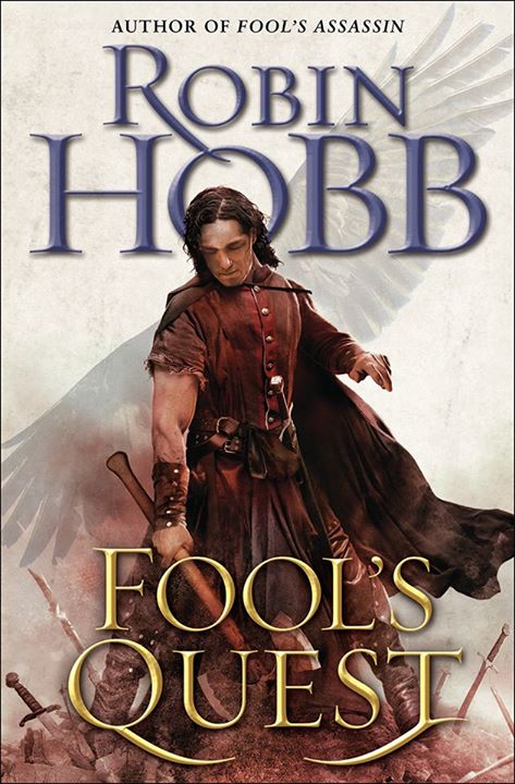
The North American cover for Fool’s Quest was revealed in January.
Most fans agreed that Robin Hobb’s return to Fitz and the Fool in last year’s Fool’s Assassin was a roaring success. Fool’s Quest is the second volume in the trilogy, and it tentatively scheduled for release in August 2015.
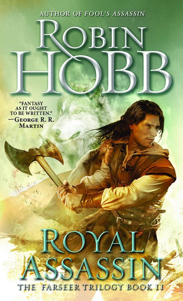
This cover is a fantasy book cover. It looks a lot like the last cover, also by Alejandro Colucci. Fitz has an axe, which is good, and he continues to look older and more grizzled (as Hobb points out in her blog post announcing the new cover!) I like that Del Rey has created a natural progression in the artwork that starts off looking somewhat like YA, before traipsing into full-blown moody Fitzdom. Seems suitable, if you’ve read the books.
Standing atop a pile of broken weapons, the detritus of war, is very similar to the covers that appear on Mark Lawrence’s Broken Empire Trilogy, so it’s interesting to consider the difference in posture and emotion of the two main characters. Cocky and victorious Jorg Ancartch, and brooding, sorrowful FitzChivaly Farseer. It’s an interesting contrast, though likely unintentional.
I’ve ragged on a lot of covers with sultry-looking dudes in LARPing gear, but there’s something about these character-centric Robin Hobb covers that works for me. While not quite the homerun that the new covers for Hobb’s Liveship Traders trilogy are, the aging of Fitz, from young adult to weathered, handsome dude is a great touch for past fans of the series. Plus Fitz has an axe, so… yay.
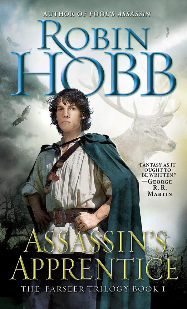
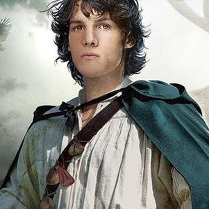
Incidentally, young Fitz is the perfect draw for a young adult audience, who will be attracted by the bright colours and familiar design conventions. I discovered and loved Hobb’s work as a teenager, and I can see these new covers opening a lot of doors for a new generation of readers.
I could have done without the floating animal head ghosts, though. (JK, Nighteyes, I still love you.)
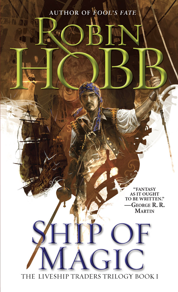
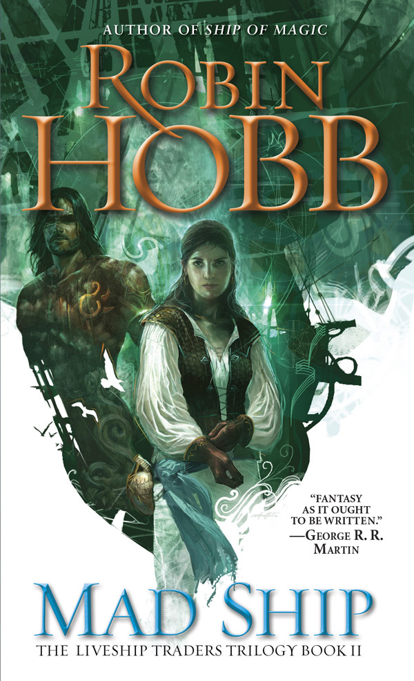
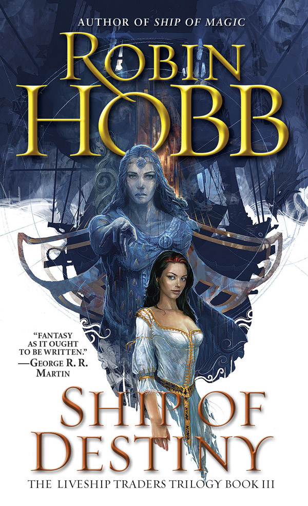
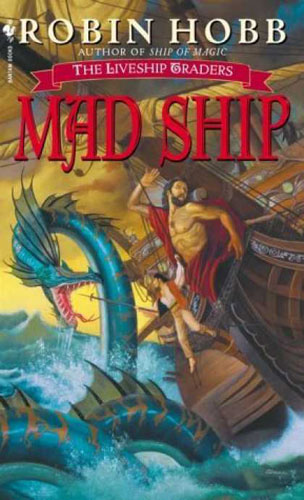
Robin Hobb has unveiled new covers for the Liveship Traders trilogy, with art from French artist Didier Graffet, and they’re mighty fine.
The previous North American covers for the Liveship Traders series were, umm… less than ideal (though perhaps ahead of their time for artist Stephen Youll’s illustration of a strong woman on the cover, without her boobs hanging out), and these are a big improvement. It’s too bad that that beveled text has become part of Hobb’s brand, though.
Graffet’s work might be familiar to Hobb fans for his work on the French graphic novel adaptation of the Farseer trilogy. “I was delighted when I first saw his images of the Farseers on the various covers [Graffet] did for the Soleil graphic novels of The Farseer Trilogy,” said Hobb. “So I am delighted to now have his work on the US paperback covers.”

