Posts Categorized: Art

HHc6v7A1QJzRFxVARZHwIi2I9hxz

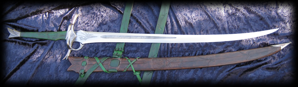
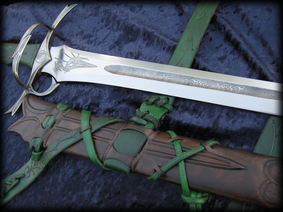
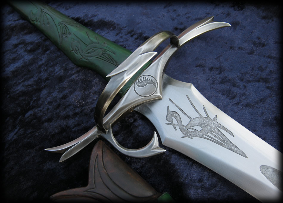
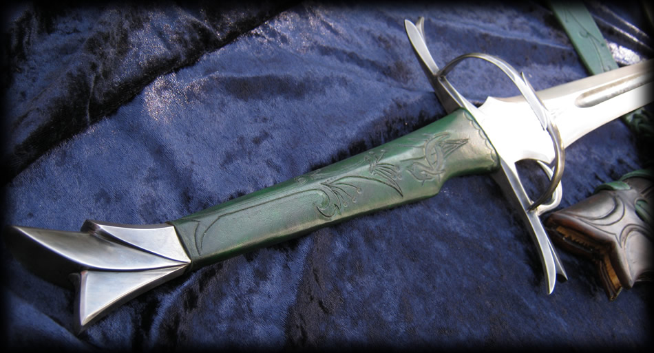
This Heron-mark Sword, designed and smithed by Fable Blades is inspired by the famous weapons of the Blademasters from Robert Jordan’s Wheel of Time series, including protagonist Rand al’Thor.

The sword, which measures 45.25″ from tip-to-tip, is made of twice-tempered steel (blade) and ebony (grip) and features beautiful detailing, such as Rand’s iconic heron mark, Aes Sedai-inspired symbols, and an engraving that Wheel of Time fans will recognize: “Death is Lighter Than a Feather, Duty is Heavier Than a Mountain”.

According to a post on Reddit, the sword has been designed with realistic weight, size, and mass production possibility in mind. However, Fable Blades produces only one-of-a-kind pieces on commission only. Read More »

spaceshipsspaceships-3spaceships-1spaceships-2

Dirk Loechel, a visual artist from Germany, loves spaceships. So much so, that he created a beautiful scale chart of hundreds of spacecraft from many of the most popular science fiction IPs, including Warhammer 40k, Star Trek, Gundam, Final Fantasy, and even Spaceballs. If you’ve got a favourite ship, it’s probably in there!

The scale of the chart hit me when I spent five minutes looking for the Enterprise D, expecting it to be among the middle-ish of the pack in size. I had to squint to find it. Loechel’s chart uses a pixel:metre scale of 1:10, making the chart itself 57km tall and 43km wide. That’s a lot of spaceship.

(Full chart after the jump.) Read More »

dinoriders1

How cool is that image? It’s a bunch of dinosaurs equipped with laser beams and cockpits. Who cares if you have Dimetrodons and Pachycephalosaurus living in tandem? It’s dudes riding dinosaurs with lasers. Dino Riders was my Jesus as a kid. As a dino-obsessed youth, the idea of riding dinosaurs into battle was the thing of legends and far-off planets where anything was possible.

Today, Tor.com revealed not only 2014’s best cover, but also the winner of the 2016 Hugo Award for Best Novel: The Dinosaur Lords by Victor Milán. He and I might be a generation apart, but, in our love of dino steeds, Milán and I are clearly cut from the same cloth, and the legacy of Dino Riders is alive and well. Read More »

follow_our_rules_by_aquasixio-d6ynbbsprotect_me_from_what_i_want_by_aquasixio-d55oynncalypso_by_aquasixio-d62qd70life_is_now_by_aquasixio-d7whbjmPrismatic_by_AquaSixioaccording_to_my_jealousy_by_aquasixio-d5q1cqtswamp_of_soap_by_aquasixio-d5awxiwkatharsis_by_aquasixio-d78h3poBlowing_Bubbles_by_AquaSixiospringtime_in_our_hands_by_aquasixio-d5hrquu

Cyril Rolando, known online as AquaSixio, is a French illustrator who works predominantly with digital mediums, such as Photoshop. “My artistic approach is set between surreal and fantasy style… in one word : Otherworldly,” he says of his art.

“I want to ‘tell a story,’ not just ‘show pixels,'” says Rolando of his digital art. “Tim Burton and Hayao Miyazaki are both the roots of my own world. I like the surrealism movement, especially the work of Boris Vian and his Foam of the Daze (l’écume des jours). I like the absurdity, the creativity and the enchanting universes, where colors bring more emotions than thousand smiles or a million tears.”

Living on an island, I’m drawn to many of the thematic elements that Rolando incorporates into many of his images: waves, underwater, aquatic life, snow, rice beds. Doubly impressive is the way that the running theme of water is utilized without all of the images feeling repetitive or same-y. Rolando fills his images with deep blues, rich purples and reds, and nurses out a lot of evocative emotion through his use of colour.

You can follow Cyril Rolando on Tumblr and DeviantArt. His art is available for purchase through his online store.

the-spiders-war-by-daniel-abraham

I’ve got one response for this:

272

(Okay, I actually have more than one response, natch, so bear with me. Orbit Books is one of the few big SFF publishers that understands the value in building a brand for its authors. When they weren’t happy with Brent Weeks’ cover for The Black Prism, they recovered the whole series and created an eye-catching and instantly recognizable series on bookstore shelves. They’ve done so with James S.A. Corey’s The Expanse, and Ann Leckie’s Imperial Radch series. The packaging and branding for Daniel Abraham’s The Dagger and the Coin was never their finest work, but it was bold and the emblematic weapon (sword, axe, torch, shield and spear) were consistent and matched scale. Read More »