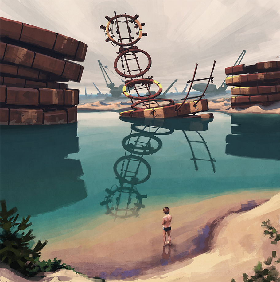
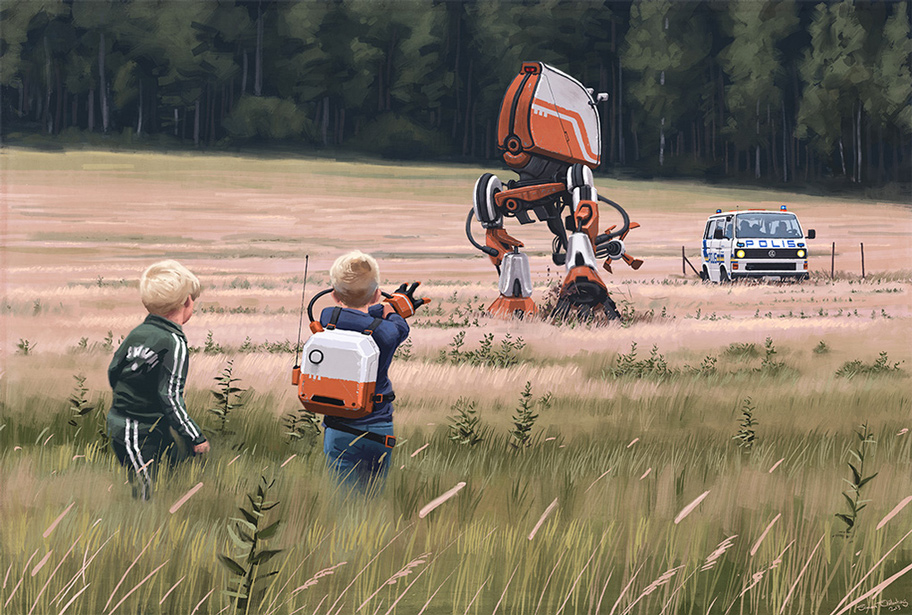
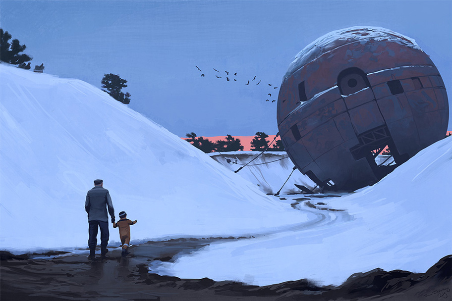
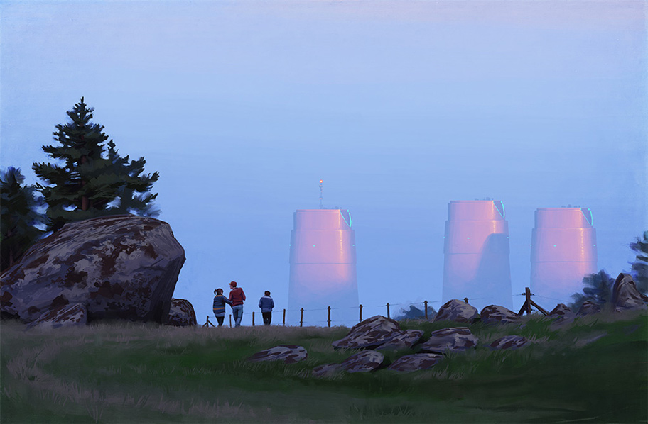
Welcome to rural Sweden, sometime in the late ’80s. Citizens go about their mundane lives and children explore the countryside. But something isn’t quite right. Robots and hovercrafts are commonplace, and decaying science facilities sprout from the harsh Scandinavian landscape. There’s even a rumor circulating that dinosaurs have returned from the dead after some failed experiment.
As a huge fan of Valve’s Half-Life series, and particularly Viktor Antonov’s relentlessly haunting, but startlingly believable, visual direction and world building for a dystopian future, I was immediately drawn to Stålenhag’s art. Where Antonov’s vision was used to flesh out a videogame that, for the most part, requires the lead character to shoot his way to safety, Stålenhag explores a similar world, Sweden, post-disaster, and takes a snapshot of what civilian life might be like under those conditions.
In a profile of his work by Dante D’Orazio, Stålenhag explained that “the only difference in the world of my art and our world is that … ever since the early 20th century, attitudes and budgets were much more in favor of science and technology. D’Orazio described Stålenhag’s world and a future that looks, in many ways, like our present. “Despite developments in robotics and ‘anti-grav’ technology, the difficulties of the modern human experience haven’t changed,” D’Orazio said.
Stålenhag juxtaposes the looming threat of the decaying glory of a dystopian far future with the mundanity of everyday life, that effectively illustrates the idea that life happens no matter what else is going on around it. Children are featured in many of Stålenhag’s paintings and its through their eyes that we are shown the grandeur and lost history of a world that crumbled under its own weight.
More of Stålenhag’s artwork can be found at his profile on The Verge, or by visiting his portfolio.
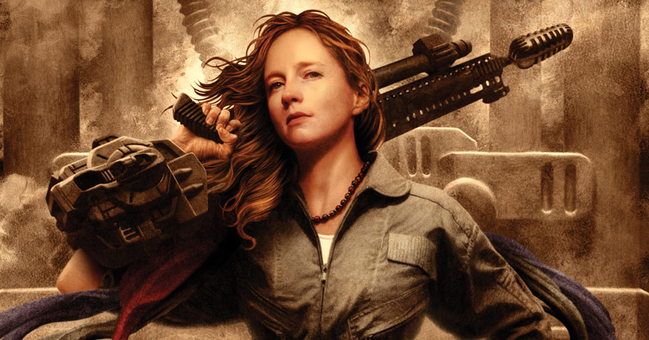
When Fantasy Faction debuted the cover for Myke Cole’s Breach Zone last week, I was struck by the impact of the cover. Not just by the impactful art from Larry Rostant, or the aggressive pose of the woman, but, that, well.. there was a woman. Cole writes military fantasy (science fiction?) and the covers of his past books have featured male-heavy casts aimed to appeal at a particular crowd of reader. I’m still not terribly sure what I think about the cover, so I reached out to Cole and asked him for his thoughts on the new cover and, specifically, the inclusion of a woman. Read More »
Outside of the places we convene as a tribe, such as Worldcon (coming up in San Antonio this coming weekend), it’s hard to find locations where the science fiction writer in me feels at home. It’s easy to go where people love fantasy, and perhaps – just perhaps – mumble behind their hand that they read science fiction. Maybe they say they read ‘it’ when they were younger. But this year I found a new place where fantasy is mumbled about and brings a blush to the cheeks, while the faces of SF gurus show up in PowerPoint slides. Read More »
Readers, in many ways, want the same experience they’ve already had, only slightly different.
I was at a convention recently, and I was sitting on a panel with R.T. Kaelin, Timothy Zahn, and Pat Rothfuss. The subject of the panel was the ins and outs of writing the trilogy, but as you tend to do on panels, we started to wander toward other topics. Thus was born the subject of this post.
I was blabbering on about how you create arcs, not only for individual books but for an entire series (a trilogy or longer series), and I coughed up that old chestnut, that your characters need to change over the course of the story. Pat, being the contrarian he is, said something like, “I don’t really know that that’s true. Readers, in many ways, want the same experience they’ve already had, only slightly different.” I’m paraphrasing, of course, but the point is that he DISAGREED WITH ME! How DARE he! No, wait, that isn’t the point at all. Once I got over being flustered, I started to think of all the ways I could defend my point.
I ran out of those relatively quickly.
Then I started thinking about the ways I was wrong. Is it true? Should characters, in fact, not change much at all? Read More »
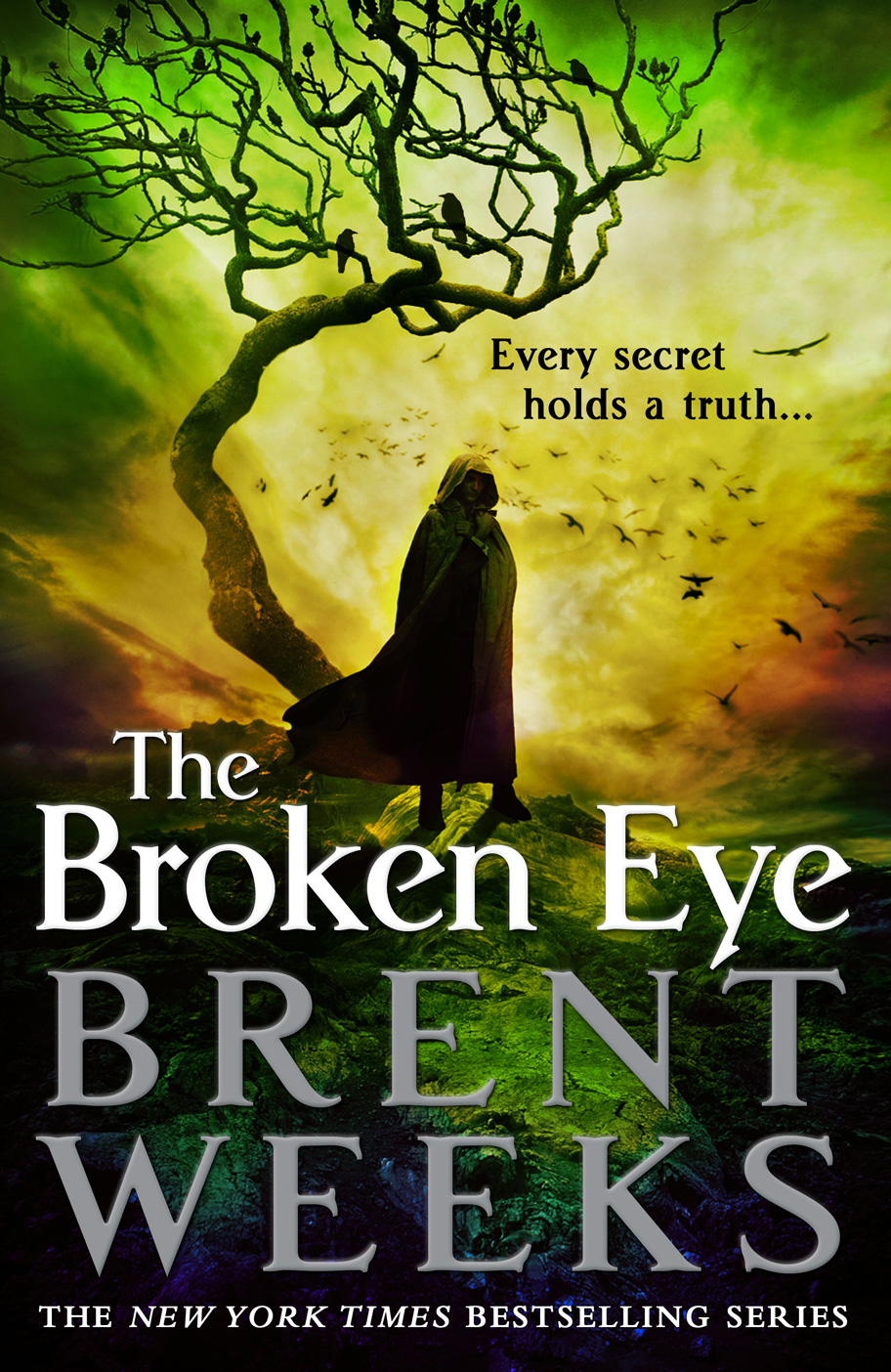
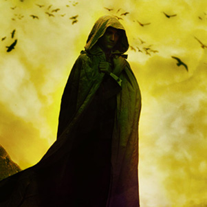
Some part of Weeks’ original (and screamingly fast) success is the result of the bold and unique (at the time, one must remember) covers for his original trilogy. Generally, a publisher is able to bring this sort of branding along with an author, but the hooded man (and the minimalist cover style) became so popular that Weeks brand was essentially stolen by the genre at large. Seriously, blame him for the hooded man, for he unleashed that demon on the world. Orbit has done a great job of evolving the look of the series to feel unique and impactfully branded, despite incorporating one of the most (nay, the most) overused tropes in Fantasy covers. The hooded man is prevalent, but the bold (and series-appropriate) splashes of colour, contrasted sharply against the black background, is striking and immediately recognizable as a Weeks book. Read More »