
Posts Tagged: Art

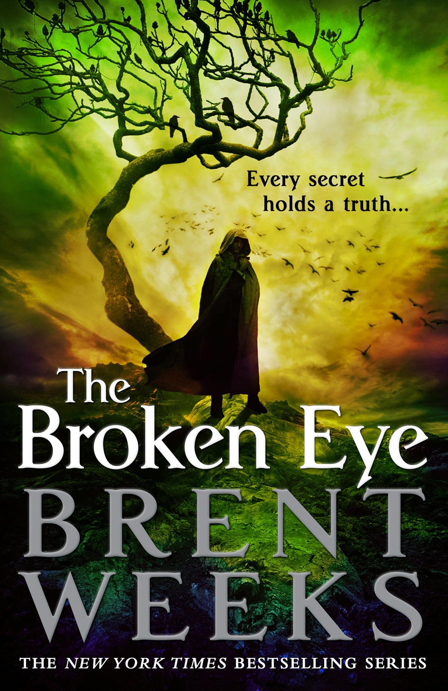
The Broken Eye by Brent WeeksThe Broken Eye by Brent WeeksThe Broken Eye by Brent WeeksThe Broken Eye by Brent Weeks

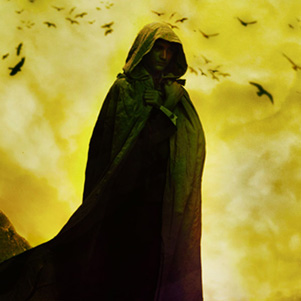
Some part of Weeks’ original (and screamingly fast) success is the result of the bold and unique (at the time, one must remember) covers for his original trilogy. Generally, a publisher is able to bring this sort of branding along with an author, but the hooded man (and the minimalist cover style) became so popular that Weeks brand was essentially stolen by the genre at large. Seriously, blame him for the hooded man, for he unleashed that demon on the world. Orbit has done a great job of evolving the look of the series to feel unique and impactfully branded, despite incorporating one of the most (nay, the most) overused tropes in Fantasy covers. The hooded man is prevalent, but the bold (and series-appropriate) splashes of colour, contrasted sharply against the black background, is striking and immediately recognizable as a Weeks book. Read More »
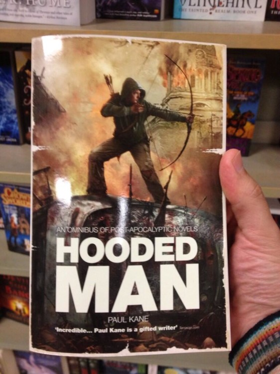
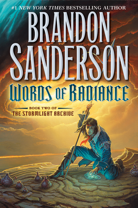
Words of Radiance by Brandon Sanderson

So, let’s talk about the recently revealed cover for The Way of Kin— err… wait, I mean Words of Radiance, the second volume in Brandon Sanderson’s Stormlight Archive. I won’t ever blame you for mistaking the two books, so, please, afford me the same luxury.

Now, let’s talk a little bit about one of publishing’s biggest catch-22 arguments. Fans have cried ‘foul’ time-and-again when publishers step in and change the style of a series’ covers midway through. It’s great when a completed series gets a re-issue, but, I think I can speak for most fans when I say that it’s nice to have a matching set of books on your bookshelf. On the flip side, though, there are a lot of cases of lazy design work, with the publisher, or at least the art department, jumping on board with what worked in the past and riding it until it keels over from exhaustion. A good example of this is the early cover for Brent Weeks’ The Black Prism. Orbit found huge success with Weeks’ first trilogy, in large part because of the striking covers. Back then, the hooded dude was still waiting tables, just trying to catch a break. Now, he’s everywhere, we’re sick of him, but he established a strong brand for Weeks and his Night Angel Trilogy. The first cover leaked to the public looked like a sequel to Weeks’ first trilogy even though it was an entirely new series. The cover was changed before publication. And then a new cover was issued for the recent trade paperback edition of the novel. It’s gorgeous. Orbit has done a great job of recognizing the need to create a strong brand for Weeks, but not at the expense of driving the concept into the ground. Read More »

Khoa Ho’s Superheroes – Past/Presentkhoahosuperheroespaspresent6khoahosuperheroespaspresent5khoahosuperheroespaspresent3

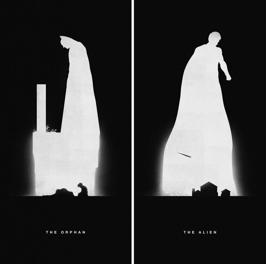
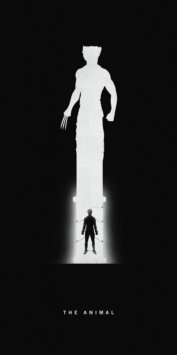
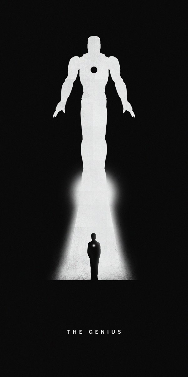
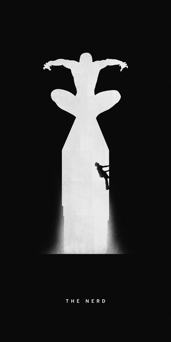
Every good superhero has an origin story. In fact, I’d say it can be argued that every good superhero, and supervillain, must have an origin story. A drive to do good, to right the world. A motivation for revenge against their past sins, or to ensure that the mistakes they’ve made are not repeated. San Francisco-based artist Khoa Ho explores this collision of past and present in his series of posters, titled Superheroes – Past/Present.

Ho and his art are profiled on My Modern Met by Pinar:

California-based artist Khoa Ho’s poster series titled Superheroes – Past/Present features iconic superheroes like Batman, Superman, and Spiderman as creatively designed silhouettes revealing their former struggles and current strength. The series draws inspiration form the Batman Begins quote: “It’s not who you are underneath. It’s what you do that defines you.”

The graphic designer’s simple silhouettes are both wonderful to look at and a real treat for comic book lovers. Anyone who knows the stories behind each of these heroic characters will be able to identify the lower half of the image that alludes to past trials and tribulations that have helped form the brave vigilantes they are in the present day.

The ability of these posters to tell the stories of their heroes is simple and effective. One cannot know the hero without first understanding the boy or girl who they once were. These posters capture that history with appropriate melancholy.

To learn more about Khoa Ho, or to find more of his art, you can visit his official website. He also has a collection of art on his Behance page, where he says he’s, ‘just trying to make the universe a better place.’

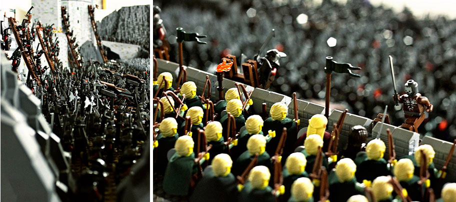
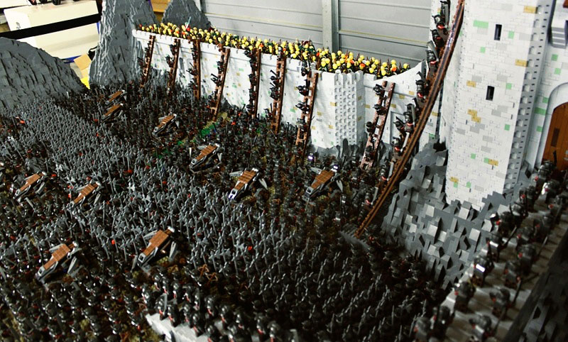
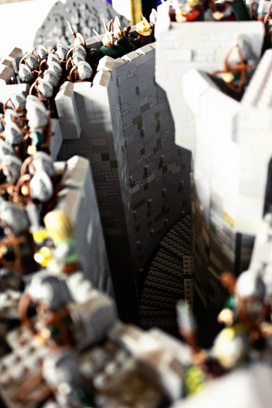
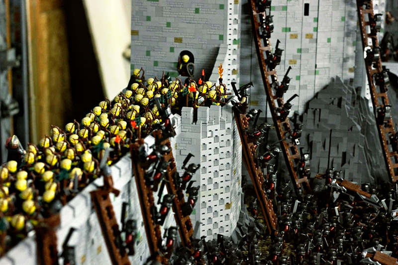
helms-deep-tophelms-deep7helms-deephelms-deep2

Who doesn’t love LEGO? As a child with a strong sense of imagination, and a tendency to be happy enough staying indoors on a rainy day, LEGO was a door that allowed me to enter into an infinite number of other worlds. My time with LEGO and my time discovering Tolkien’s Lord of the Rings didn’t quite intersect, but they’re both formative parts of my childhood and adolescence. Hell, I have a LEGO set of Gandalf’s carriage, from the beginning of Fellowship of the Ring sitting on my desk at work right now.

Based on the layout of Helm’s Deep featured in Peter Jackson’s film adaptation, this 150,000 brick set piece is astounding. The artists, who go by the names Rich-K and Big J, apparently, nail the atmosphere and scale of the conflict of one Lord of the Rings most iconic scenes. At the time these photos were taken, the model was about 90% complete, with an estimated four months worth of work. The time, money and personal investment that must have gone into this project is impressive.

More photos of this LEGO Helm’s Deep can be found on the artist’s MOCpages post.